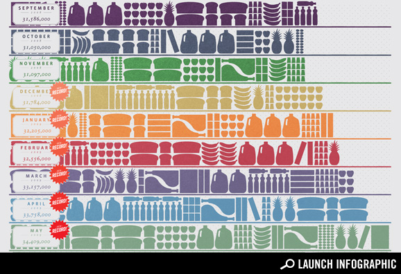
The above graphic is from GOOD (you have to click over to them in order to "Launch Infographic"), and shows the amount of money spent on food aid (in the form of food stamps) per month in the United States over the period of September 2008 to May 2009. I think that the graphic is a good one for several reasons, because it shows a trend of what this economic slump has wrought. True, there aren't food lines like there were during the Great Depression, but there wasn't a food stamps program for much of that time, either (it was first introduced in 1939). In other words, a lot of the needs of the poor have become invisible, making it difficult for people to see.
True, there are many social benefits and economic practicalities of using food stamps instead of having people wait in food lines, but the human psyche is trained to evaluate what is readily visible (i.e., can be seen "right now," covering a relatively short period of time). This "problem" of human perception is why stop-motion photography is such a wonderful mechanism to use in showing relatively slow (to the human senses) occurrences, and why Dan Gilbert said that global warming is happening too slowly. Keeping this sort of information "under wraps" (as it were) changes the political discussion that can be had, since it may be difficult to get sympathy for anonymous members that make up statistics (and makes it easy to classify them all as somehow "unworthy").
This all ties in - in some way - to the current "debate" in the U.S. about health care. I would imagine that a similar graph could be made about the growth of the uninsured (and the number of underinsured), as tied to this current recession. However, these millions of American citizens effectively remain unseen, and (therefore) are effectively outside of human perception. True, we might know that one-in-six Americans doesn't have health insurance, and we might even know one (or many). However, the sheer scale that 40 million represents cannot be grasped by the human mind. The trend of 1 million additional people per month also cannot be grasped. And these are the relatively easy numbers. The more complex ones - those involving the impacts of a status quo into the future on future national budgets, for example - are even more staggering challenges to the human mind. These inability of human perception to easily picture levels of national need and disparity make it easy for those currently against changing the status quo to cloud judgments. Even if one has scientifically enumerated facts, when those facts cannot be related to by the populace, then they are next to useless in a debate that requires an understanding of the scale and abstract nature of the facts in question.
I originally wanted to use the graphic to show that government subsidies are actually a very important thing for many Americans today, especially because of the poor economy. I was going to make a connection between the month-by-month increase in food assistance to the increases in the rolls of the uninsured. However, that got a little side-tracked. However, I believe the connection is there, and I personally wonder (with the political wonk side of my head) how many people actively protesting against "socialization" are on some sort of government program that provides them with assistance, including food stamps, unemployment compensation, Medicare, Medicaid, social security, etc. The "what if" autocrat in me wonders how many people would remain against "socialization" if the government followed their advice and stopped all these programs...
No comments:
Post a Comment