Showing posts with label maps and charts. Show all posts

Monday, August 03, 2015

Super-typhoon Soudelor and a need for new hurricane & typhoon metrics

Super typhoon Soudelor is hitting sustained wind speeds of up to 178 miles per hour! That totally blows the Beaufort scale out of the water, and also leaves the Saffir-Simpson scale well behind, too.

There are two reasons why these scales are not too useful:
  1. They all have maximum values,
  2. The maximum values are tied with technologically based assumptions and purposes.
The Beaufort scale maxes out at "Hurricane force" winds that are anything of 72.9 mph or greater, and this maximum was set based on the technological limitations of shipping, for which the scale was developed. The idea was that anything greater than a category 12 was effectively as dangerous to ships as the winds at 72.9 mph, and so there was no reason for ship captains to worry about categories larger than 12.

The Saffir-Simpson scale maxes out at "Category 5 hurricane" winds that are anything of 157 mph or greater, and this maximum was set based on the technological limitations of building construction in the 1950s US. The idea was that anything greater than a Category 5 was effectively going to blow apart any building, and so there was no reason for having higher categories (despite an increasing number of buildings with the capacity to withstand 157mph and higher winds).

It's that "or greater" part that really is troubling to me. Why? Because it means that a hurricane with sustained winds of 157 mph is classified as a "Category 5" hurricane... right along with a super typhoon like Soudelor, which is reaching wind speeds of almost 180 mph.

Back in 2011, I noted that the scale for the Saffir-Simpson scale was somewhat linear, up to Category 5; but if we took that linear scale and extended it, we would be able to include a Category 6 (and even Category 7) type of storm:

Category 1: <95mph
Category 2: 96-110mph
Category 3: 111-130mph
Category 4: 131-150mph
Category 5: 151-175mph
Category 6: 176-205mph
Category 7: 206-235mph

Under this extended classification, Super typhoon Soudelor is a Category 6; one of only a few in recorded history, but potentially one of a growing number in a future with global warming.

Similarly, the Beaufort scale can be extended beyond the category 12. The Beaufort Scale progresses along an x-squared rate (Excel comes up with the equation: y = 0.4952x^2 + 5.2857x + 0.0382), giving us:

Beaufort Number
0: <7mph
1: 0.8-3.4mph
2: 3.5-7.4mph
3: 7.5-12.2mph
4: 12.3-17.8mph
5: 17.9-24.1mph
6: 24.2-31.0mph
7: 31.1-38.4mph
8: 38.5-46.4mph
9: 46.5-54.7mph
10: 54.8-63.6mph

11: 63.7-72.9mph
12: 73.0-83.7mph
13: 83.8-94.7mph
14: 94.8-106.3mph
15: 106.4-118.5mph
16: 118.6-131.3mph
17: 131.4-144.8mph
18: 144.9-158.8mph
19: 158.9-173.5mph
20: 173.6-188.8mph

Under this classification, Super typhoon Soudelor has a Beaufort number of 20! This is very different from just classifying it as a 12, solely because 12 arbitrarily is the largest value on the Beaufort scale.


Why worry?
Back in 2011, I wrote up a short extension of a 2005 paper in Nature, that indicated that the total number of hurricanes has been remaining the same, but that the strength of the hurricanes has been growing stronger. This means that there are a lower number of Category 1, 2, and 3 hurricanes now than in the past, but the number of Category 4 and 5 hurricanes has increased:


What is being measured here is storm intensity by proxy of hurricane Category. However, such a measure will not show the entire picture if Category 5 remains anything over 157mph, since this open-ended category definition would mask the rising intensity of hurricanes that is shown in the graph.

While this might seem an academic point, another way to think about this is to ask why the Richter scale doesn't have a maximum value? After all, if the Saffir-Simpson scale was built around the idea that structures wouldn't be able to sustain a force of a Category 5 hurricane, then why shouldn't the Richter scale max out at 7.0? And if the idea that the Richter scale should max out at an arbitrary number (like 7.0) sounds ludicrous, then why accept the idea that Category 5 in Saffir-Simpson (and Category 12 in Beaufort) are the maximum of the scale?

Especially in a future where the numbers of increasingly intensive hurricanes is only going to increase as the numbers of "lesser" hurricanes decrease?

Thursday, April 09, 2015

On sectorial water use and obfuscation via statistics

So a friend of mine posted this picture on their Facebook wall, and its message seemed well-intentioned but also so very problematic.

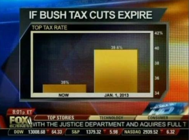
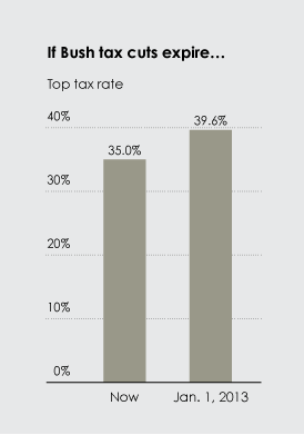
Let me first state that I do think that California must make hard decisions about water restrictions and water use, and I don't think that the current forms of water restrictions and bans are anywhere approaching what would be an equitable diminution in water use (and never mind the problems that California's system of water laws, interstate compacts, and inter-watershed irrigation systems play in creating further problems in the legal, political, and water management worlds). However, I don't know whether this image presents a useful comparison on all fronts. Furthermore, the presentation is arguably deceptive, since the compared units are not the same, with toilets (presumably being the one thing that the viewer is supposed to be sympathetic toward, since it is placed last) being based on a very low metric of gallons/flush of one toilet, and all the rest (presumably the ones the viewer is supposed to feel antagonistically toward, since they are often held up as being "enemies" of water use) being based on really large sector-wide annual figures.

This simplistic switch of metrics undermines the presumed argument of the image on two fronts. First is the casual deception: why present sector-wide annual figures for the "bad" water uses, and personal, single-use figures for the "good" water use? This presentation does not present an easy-to-grasp comparison between water uses at the State level. (There is also the problem of using words like "million" and "trillion" to describe the amount of water used, since it is so easy for people to lose the differential scales between hundred, thousand, million, billion, and trillion, but those sorts of distinctions are better covered in places such as this visualization of what $1 trillion looks like.) In order to place the water used in Californian toilets in direct comparison with the others, we must first convert the value of 1.6 gallons/flush into a figure of gallons/year throughout California. When we do this, we find that toilet-flush water use in California is at least:

1.6 gallons/flush (x 5 flushes/person/day)
= 8 gallons/person/day (x 38,800,000 Californians)
= 310,400,000 gallons/day in California (x 365 days/year)
= 113,296,000,000 gallons/year

(I write "at least" 113,296,000,000 gallons/year, since I am using the figures for household toilets and only 5 flushes/day, even though the average is somewhat higher. This number doesn't include, of course, water use statistics for public toilets, urinals, port-a-jons, etc.)

Now let's list all the water uses presented in the picture in increasing gallons/year:

70,000,000 gallons/year (fracking)
400,000,000 gallons/year (Nestlé bottled water)
113,296,000,000 gallons/year (toilet flushes)
1,100,000,000,000 gallons/year (almond farms)

When we look at toilet flushes in this perspective, it is clear that it is 1,618 times greater than the reported value for fracking. Furthermore, it is 283 times greater than the reported value for Nestlé bottled water. Indeed, when presented in this way, California toilet-water use can be presented as being far more profligate than either fracking or Nestlé bottled water, and by a LONG shot, simply because California has SO many people, and almost 60% of that population (22,680,000 in 2010) lives in sunny, drought-ridden SoCal. This places domestic water use (which includes baths/showers, toilets, dishwashing, lawn irrigation, carwashing, etc) far ahead of most industrial water uses... save agriculture

Indeed, when compared to the reported value of almond farms, toilet-water use is a mere 10%. However, there's a problem with the number presented in the graphic for almond farms. Specifically, the number of 1.1 trillion gallons/year is 1.6 times greater than the value reported by Hanson out of UCDavis, whose figure of roughly 2.1 milion AF/year works out to roughly 680 billion gallons/year (compared to this number, toilet flush water use is roughly 16%).

Let's look, though, at water used to grow alfalfa, which is, according to Hanson, the largest agricultural water use in the State. Accordling to Hanson, alfalfa grown in California uses roughly 5.2 million AF/year, or roughly 1.7 trillion gallons/year (which is about 2.5 times greater than the amount he reports for almond and pistachio irrigation). The second-largest agricultural water use (reported by Hansen) is for forages, which uses roughly 3.3 million AF/year, or roughly 1.1 trillion gallons/year.

So we can see that -- from an argument based around comparative water uses alone -- the merits of placing fracking and Nestlé bottled water fall flat, since toilet-flush water use far outstrips both of these two uses combined. It would have been a better argument to put up alfalfa farms and forage farms. However, it's almond growers that have been in the news, and not alfalfa or forage, which is likely why it is almond growers that are shown (even though they are not the largest agricultural water users, and even though they have a far more valuable crop than either alfalfa or forage crop farms).

Now, one could still use the water use figures presented in the graphic to make associated arguments, but I was unable to find a single argument that held true against the fracking, Nestlé, and almond farms while preserving toilet flushing. For example, one argument for water conservation that is often made against fracking regards removing water from the hydrological cycle completely, and it's true that one could make the argument that water used in fracking is effectively "lost" to the immediate hydrological cycle (since fracking wastewater is often deepwell injected) and therefore cannot be used for drinking or any other use, but that argument doesn't hold for almond farming or bottled water, since both return their water to the immediate hydrological cycle (primarily as groundwater recharge, evapotranspiration, and biomass decay in the case of almond farms and as urine that is flushed down a toilet in the case of bottled water). So the argument that it's about removing water from the hydrological cycle use is not valid across cases.

Another common argument against fracking, irrigation, and bottled water is that these uses are consumptive uses. In the case of fracking, this is undoubtedly true (as laid out above), and water used in agriculture is often also considered to be consumptive. However, the charge of consumptive use can also leveled at most of California's toilet water flushes, since much of the State's water is pumped from watersheds in Northern California and the Colorado River, creating consumptive water use pressures in those areas.

The only real argument that comes to mind is that it is unfair for the government to impose water restrictions upon flesh-and-blood citizens but not impose water restrictions upon corporate "citizens." However, such an argument isn't a water volume argument, but a water rights argument, especially in how Californian water rights are not egalitarian, with a large part of this argument lying in the problems associated with California's water rights laws. Most individual Californian citizens do not own any water rights, let alone water rights that predate 1914. The date of 1914 forms the demarcation date between so-called "junior" and "senior" water rights, and those holding junior water rights will have their rights to water curtailed before those of senior water rights holders. Such a system of rights is based on a "first in place, first in right" principle, with a strong incentive for the right to be held by a non-human entity (such as a corporation, water district, or the like), since the death of an individual could lead to the "death" of that right. From an equity perspective, such distributions of water rights is inherently inequitable, since it creates structural inequalities that become evermore entrenched as the value of water increases (making the purchase or transfer of water rights less likely to occur). During times when water availability is high, such a structurally unequal distribution of water rarely impacts large swathes of citizens. In cases of drought, though, such inequalities emerge. But regardless of the structural inequalities that California's water rights system imposes upon its citizens, the percecption of unfairness in who gets the restrictions is not due to water volumes (as the graphic implies), but due to water policy and water law.

One "good" note though (if only from a perspective of masochistic schadenfreude), is that if the drought continues, it is likely that even those holding senior rights (which includes many major agricultural water users) will have their water withdrawals restricted.

In sum, while bottled water and fracking are often seen as problematic for various social, public health, and environmental reasons, the comparative water consumption in these two sectors doesn't hold a candle to the total sector-wide water consumption of toilets. Furthermore, hiding the scales of water use between different water uses in the way presented in the graphic is deceptive, and such deception can foster mistrust of the messenger or supporter of the message. In other words, in order to make the graphic less deceptive and more salient to a message associated with different types of water use, it needs more than just a simple comparison of water volumes.

Of course, this additional nuance can create problems when trying to disseminate a message...

Wednesday, February 18, 2015

Wednesday Omphaloskepsis: Will combining two forms of birth control increase overall birth control effectiveness?

Screen capture taken from visualoop.com, which shows the first two of three rows of the interactive graphic from the NYTimes article "How Likely Is It That Birth Control Could Let You Down?"

A friend of mine posted a link to this article on the effectiveness rates of various forms of birth control, from highly ineffective methods, such as fertility awareness based methods (i.e., the rhythm method) and withdrawal (i.e., “pulling out”) shown above, to highly effective methods, such as female sterilization (i.e., a hysterectomy) and male sterilization (i.e., vasectomy), not seen in the graph above. All of these statistics were presented as increasing rates of getting pregnant over a 10 year period, so the reader could directly compare the cumulative rates of pregnancy over time. An interesting thing is that some of the graphs show the differences between the "optimal" and "typical" rates of getting pregnant. Some of the methods, such as "spermicides" and "sponge (after giving birth)," show optimum curves that are not that better than typical curves, while other methods, such as "Pill, Evra patch, NuvaRing" and "Depo-Provera" show major differences between the optimum and typical curves. This indicates that some methods are minimally impacted by "human error" (e.g., improper use of spermicide or improper placement of the sponge), while others heavily impacted by such errors (e.g., using the Pill irregularly).

(A note to my fellow pedants: Here, I will be only considering the final (i.e., 10 year) rate, and so instead of referring to a chance of “X in 100 over 10 years,” I will refer only to a chance of “0.0X.” Yes, I know that there is a difference between “X in 100 over 10 years” vs. “0.0X,” but I don’t want to write “X in 100 over 10 years” over and over in this entry, and I assume that the reader doesn’t want to read “X in 100 over 10 years” over and over in this entry, so let’s just recognize that when I write “0.0X” in this entry, I implicitly mean “X in 100 over 10 years.”)

Interestingly, the most effective method on their chart wasn’t sterilization (which had a rate of 0.05 for women, and a rate of 0.02 for men), but actually a hormonal implant (which has a rate of 0.01). This raised a question in my mind: would it be possible to combine birth control methods in order to diminish the overall chance of getting pregnant? It is quite alluring and – on the surface – seems to make perfect sense.

Well, the more I thought about it, the more the answer was: it depends.

Although it's been several years since I studied reproductive physiology, I suppose that there would be some increased effectiveness if a couple combined two or more methods. Statistics indicates that, if the two methods were truly independent, then you multiply the two rates together (much like the chance of rolling two sixes with two dice is 1/6*1/6=1/36 and not 1/6+1/6=1/3). Therefore, if the woman uses one method and the male uses another method, then we can assume that the two methods are independent of each other, thus allowing us to multiply the two effectiveness rates together. Therefore, if a woman is using only spermicide (0.94) and if her male partner uses only the withdrawal method (0.92), then the possibility of pregnancy IS lower than the use of one of those methods alone (0.94*0.92=0.88); slightly worse than male condom alone (0.86).

However, if the two methods are not independent (like withdrawal and male condom), then one cannot simply multiply the two rates; an additional correctional factor must be multiplied to account for the codependence inherent in the two methods. Two additional hitches: (1) we don’t know what that correctional factor is, and (2) it will likely be different for each combination of codependent methods. However, even though we don't know what any of these correctional factors are, we could make the assumption that no two birth control methods will be synergistic (i.e., no correctional factor would be >1), which means that multiplying the two rates together produces an indication of the best potential effectiveness for typical use. Therefore, if the male partner uses both withdrawal and a male condom, the best potential effectiveness for typical use is (0.92*0.86=) 0.79.

However, the major take-away (at least for me) is the worlds of difference seen in the comparison between the effective pregnancy rates shown in the first two rows when compared with the third row. It’s like night and day. If one of the partners is using a method from the third row, the improvements provided from the use of any of the methods shown in the first two rows is effectively negligible. For example, if we look at combining male condom use (0.86) with female sterilization (0.05), and assume that these two method were totally independent (which is – in my opinion – a safe assumption in this case), then the resulting chance of pregnancy over 10 years of using this combination of birth control measures is (0.86*0.05=) 0.04; a change of 0.01.

The only way to see a significant improvement within this bottom row is if they were combined with another method from the third row. In the case of combining male sterilization (0.02) and female sterilization (0.05), the resulting chance of pregnancy over 10 years would be 0.001 or a 50-fold increase over female sterilization alone.

Of course, the statistics presented in the article are rates garnered at a population level. Like so many things in life, when one looks at individual cases, the picture can appear quite different. After all, in order to get that number of “5 in 100 over 10 years” for female sterilization, there had to be some women who got sterilized and also got pregnant. Part of this is due to potential errors in the medical procedure or with the medical device. Part of this is due to individual physiology. But while one can’t really change the impacts of either of these two factors, there is one other factor that alters an individual’s chance of getting pregnant: their copulation rate.

If a person's copulation rate is really high, it will have a major effect on the possibility of that particular individual getting pregnant, even if the effectiveness of their birth control method doesn't change. Why? Well, let's assume we are looking at a woman who has been sterilized (0.05). If this woman has sex only one time without any additional birth control, that chance 0.05. If that woman has sex once every single day for 10 years, then each time she has sex, there is an additive 5-in-100-over-10-years' chance that she will get pregnant. (Why is it additive and not multiplicative here? It’s for the same reason that there is a 1/6+1/6=1/3 chance of rolling at least one 6 when you roll two dice.) Of course, the chance of a resulting pregnancy (in the case of female sterilization - as with all of the cases on the bottom row) remains vanishingly small, due to the effectiveness of the form of birth control, but - given enough sexual encounters - the rate of 5-in-100-over-10-years does imply that a pregnancy will occur. And indeed, it does happen:
[A] mother from Menden, North Rhine-Westphalia, decided to have the sterilization after the birth of her second child in 2006. ... But in 2008 she became pregnant again and gave birth in 2009.
The truth is that having a copulation rate of zero (i.e., never having sex at all) is the best preventative to getting pregnant. (Keep in mind that this also means that you don't try to get in vitro fertilization, either.) Indeed, this course of "abstinence only" pregnancy control is often the method preferred by religious organizations (at least in the United Stated). Of course, what with humans being the biological animals that we are, copulation (and resulting pregnancy) tends to happen, even to men and women sworn to clerical celibacy.

Thursday, October 09, 2014

Support for SSM continues to grow, but unevenly. (Also, what constitutes a "large portion" of a population?)

I recently saw this graphic from YouGov about the various levels of support and opposition for same-sex marriage:


Pretty cool graphic. The accompanying text pointed out that "Americans who are likely to vote in the upcoming elections tend to support (48%) rather than oppose (39%) allowing gays and lesbians to marry." This confirms reporting about polls showing general support in the US population for SSM. And - unlike inter-racial marriage - the popular position is leading the legal position, as xkcd shows in another of his amazing graphs:


Pretty neat stuff, especially for data, graph, and map nerds like me.

And then... I read the comments...
Well, I made the mistake of reading the comments, and I found - at the end of one relatively short string of back-and-forth - a statement by "William," who (for some reason) couldn't understand how the non-discrimination language of the 14th Amendment worked to alter the 1st Amendment. (In brief - and remember: IANAL - the 1st Amendment disallows Congress from making state laws about the establishment and practice of religions. The 14th Amendment disallows any state from discrimination, even if it's religiously justified discrimination. There. Not too hard to understand.) This is what he wrote:
Where is the lack of equal protection? Gay people have equal protection. What gay people want is a special classification for their perverted behavior and for everyone to accept that perverted behavior. Acceptance of the homosexual perverted behavior will Never be accepted by a large portion of the United States.

Concerning sentences 1 & 2
Well... The first two sentences are a patent misunderstanding (whether deliberate or not) of why anti-SSM creates a lack of equal protections. Maybe William should go read explanations online (such as at Wikipedia).

Concerning sentence 3
The third statement (discounting the obvious and heavily biased point of view) is just a case of special pleading on his part. As Ricky Gervais points out:
Same sex marriage is not gay privilege, it's equal rights. Privilege would be something like gay people not paying taxes. Like churches don't.
I couldn't have said it more succinctly. But perhaps William just doesn't like Ricky Gervais. Well, the edited volume by Rimmerman and Wilcox has a better explanation as to why SSM isn't a "special classification" and isn't actually the conferral of special privileges:
Antigay groups insist that allowing gay couples to marry represents granting gay people a special right on top of the right they already have. ... The Family Research Council compares laws restricting marriage to opposite-sex couples to laws preventing cousins from marrying and laws preventing adults from marrying children... "since these restrictions apply equally to every individual" (Sprigg 2003).
          In other words, since a gay man could marry a woman and a lesbian could marry a man (as many gay people have done -- often resulting in unhappy and dysfunctional marriages), they have the right to marry. But for a person who is attracted to and capable of falling in love with someone of the same sex, such freedom or right is pretty meaningless. In fact, these restrictions do not "apply equally to every individual" but limit the ability of gay people only to protect their life partner relationships.
          People on death row, mass murderers, rapists, and child molesters can all get married as long as they are marrying someone of the opposite sex. Yet gay and lesbian people are denied this fundamental right because the people they love are of the same sex. Their right to marry someone of the opposite sex doesn't mean much; it doesn't allow them to marry the person they love.
(Emphasis mine. Emphasis in the original.)

Perhaps William would respond with some version of the slippery slope argument (since many anti-SSM arguments usually fall back on some version of the argument of, "Well, if we allow men to marry other men, then what's to stop plural marriage, incest, or bestiality?" I'll let John Corvino take this one.


Concerning Statement 4 (the real "Hunh?!?" statement to me at this time)
But it was the last statement that had me scratching my head: "Acceptance of the homosexual perverted behavior will Never be accepted by a large portion of the United States."

Ummm... But SSM is already accepted and supported by the majority of the United States population. This - by definition - means that SSM IS "accepted by a large portion of the United States."

A recent Pew poll shows a 54% majority in favor of same-sex marriage, and the anti-SSM position is only 39% and falling.

In other words, "the homosexual perverted behavior" that William contends will "Never be accepted by a large portion of the United States" is actually - right now, today, throughout the United States - accepted by the majority of the populace. This means that the largest portion of the United States supports "the homosexual perverted behavior" (or at least allowing people who are homosexual to get married to another person of the same sex).

Now, William could say that what he actually meant by "large portion" is actually some portion of the population that is smaller than the majority, but that is still "large." But that raises the question of when is a "large portion" no longer large? Based on nothing more than the idea of a pluarlity being a portion large enough to become a ruling party (and assuming a three-party system like in the UK), I'd argue that 33.333% (i.e., 1/3 of the population) is scraping the bottom of credulity for what it means to be a "large portion." (I could have used the Italian multi-multi-multi-party system, but that case is far more complex than the three-majority-party system of the UK.)

(As a side note, I'd extend the above logic to say that  anything less than 1/3 changes is no longer a "large portion," and it enters into "minority" territory, although I'd be generous and say that anything more than 1/10 makes a group a "sizeable minority," but a minority nonetheless. In other words, if a position is supported by less than 1/3 of the population, I'd argue that it's not a position held by a "large portion" of the population.)

Now time for a thought experiment!
Okay, now that we've got a cut-off of what a (semi-credible) definition of "large portion" actually might be (I'm saying that it's 1/3 of the population), we need to determine how quickly the anti-SSM position will fall below that threshold. We have data from Pew on anti-SSM polling, and it's apparent that - since 2009 - there has been a relatively linear trend (whereas before 2009, anti-SSM sentiment bounced around without any major trend). Now, given this strong trend since 2009, let's just assume that the popular trends of anti-SSM from the Pew poll continue along the paths of the that they have been on since 2009. (Yes, I am well aware of the problems of doing linear extrapolations into the future, but this is just a simple thought experiment.) Plugging the data into Excel, we get a linear trend for the anti-SSM from 2009-2014 has an R^2 of 0.9069 (which is pretty friggin' high, given that the maximum is an R^2 of 1), and using the regression equation, we get the following projection:

2015: 36.07%
2016: 33.44%
2017: 30.81%
2018: 28.19%
2019: 25.56%
2020: 22.92%

Yowzers. If the anti-SSM trend continues (and that's a big if, supported by nothing other than arm-waving conjecture), then it will be around 2016 that the portion of the US that holds William's position drops below 1/3 of the country, and - as such - it can no longer be counted as a "large portion." Furthermore, it will be sometime in 2020 that the portion of the US that holds William's position can no longer (at least in my books) be counted as a "sizable minority."

But what if I took the entirety of Pew's polling, and go all the way back to 1996? Well, the slope will be less steep, which does change the resulting percentages (but the R^2 drops to 0.8853, which - admittedly - is still pretty good):
2015: 40.73%
2016: 39.34%
2017: 37.96%
2018: 36.57%
2019: 35.19%
2020: 33.80%

So... not as drastic. If we assume (again, based on nothing) that the overall trend from 1996-2014 is actually the more realistic trend in the anti-SSM position, then William's position will only cease to be a "large portion of the US population" sometime in 2021 by this estimation. Still 7, years is still a lot faster than his contention of "Never."

Of course, there's a reason for this trend: a major generational shift. As Pew reports on this crucially important fact:
"Currently, 68% of Millennials favor [SSM], compared with 55% of Gen Xers, 48% of Boomers and 38% of the Silent generation."

Or, to put it another way the kids (aged 5-13) in the video below will become eligible voters in 2018-2026 (when the members of the Silent generation will be aged from 73-88 in 2018 and 81-96 in 2026):

Saturday, August 30, 2014

Apparently Russia and Canada can't agree on what belongs to Russia

NPR had a fun-with-maps story about how Canada's delegation to NATO tweeted the following map to show where Russia is (and isn't):
This was in response to Russia claiming that the Russian military convoys and vehicles that had entered Ukraine were just lost... or something similarly implausible.

However, look at the map that the Canadian delegation sent. It fails to label Kaliningrad as being part of Russia. By the way, here's a handy map showing you where Kaliningrad is:
Whoops! Apparently the GIS program that the Canadians were using didn't automatically include Kaliningrad as Russia. But the lack of recognizing Kaliningrad as part of Russia was apparently less important than showing that Crimea was Russian and that Abkhazia wasn't Georgian. This is the "corrected" map that Russia tweeted back to the Canadians:
(Never mind that almost the entire world doesn't recognize Abkhazia. Never mind that almost the entirety of the world doesn't recognize Russia's claim to Crimea, either.)

Wednesday, August 07, 2013

Musings on Lactose Persistence

An interesting map of lactase persistence from Nature:


Differences in Gene Expression & Hybridization
An interesting things from the article:
Most people who retain the ability to digest milk can trace their ancestry to Europe, where the trait seems to be linked to a single nucleotide in which the DNA base cytosine changed to thymine in a genomic region not far from the lactase gene. There are other pockets of lactase persistence in West Africa (see Nature 444994996; 2006), the Middle East and south Asia that seem to be linked to separate mutations3

Since lactase persistence in West Africa, the Middle East and South Asia all seem to be linked to separate mutations, I wonder:

  1. if the different mutations for lactase persistence are differently efficient, and
  2. if people who have parents from different lactase hotspot regions have significantly different lactase production capability.
Since the mutations of lactase persistence occurred independently in these different populations, it means that it is possible that each population might have a different efficiency of producing lactase. (It's not necessarily true, but it is possible.) For example, if Northern European populations could digest x milliliters of cow milk in t seconds, would West African populations be able to digest the same quantity in the same amount of time? Would this hold for all quantities? For commonly drunk types of milk (e.g., cow milk, goat milk, sheep milk, mare's milk, camel milk, etc.)? And for all hotspot populations? These would be interesting things to check out (especially if you were a cereal company who wants to open new markets...)

With regard to the question of whether genetic hybrids would have better capacity of producing lactase, it is important to determine whether the trait is dominant or recessive. In a comparative study between the Northern European and the Middle Eastern mutations for lactase persistence, the authors assume that the genetics of both mutations are dominant traits, which would mean that only one gene is necessary for the trait to be expressed. If a person had both the Northern European mutation and the Middle Eastern mutation, therefore, it is likely that they could well express both lactase persistence mutations. (The assumption of dominance is also more likely, considering that upwards of 90% of the populations in the hotspots can digest lactase, which strongly implies that it's a dominant trait, since a recessive trait is unlikely to emerge at such a high rate, unless there were some strong selective pressures for that trait.)

The Mongol Question
In another note, the article is mum about Mongolia. Indeed, the shading of lactase persistence is at a pretty low resolution (as it is for much of Asia), but it estimates it at around ~45%. This strikes me as a little odd, since much of the population does consume mare's milk, and some regions also consume yak milk and others consume camel milk (i.e., in those regions where they herd yak and camels, respectively). From these milks, different products are made, which serve as a major food source throughout the year. Now, maybe ~55% of the Mongolian population is lactose intolerant, and just go around with the runs and bad gas all the time, but I couldn't find any information about Mongolia. Instead, when I looked for lactose tolerance data for Mongolia, I kept pulling up a 1984 study of ethnic populations in China, including Inner Mongolia. One note, though: Inner Mongolia has a very different demography than the nation of Mongolia, and it's not clear from the reviews of the study that the authors tested ethnic Mongols (who are a minority in Inner Mongolia), Han Chinese (who are the dominant majority), or other minorities (e.g., Manchus, Hui, Daur), or even if they determined the level of hybridization of the subjects (since determination of ethnicity is a social construction - in which a person who is half-Han could still be considered to be Mongol and other ethnic minorities are also considered to be Mongol - whereas lactase persistence is based on biology). I'm going to guess - based on only anecdotal evidence and inference - that the degree of lactose persistence in Mongolia is higher than that of Inner Mongolia and that it could well be higher than the ~45% indicated on the map.

Even though the resolution of the data is pretty sparse in Asia (apart from South Asia), it's interesting to note that if we assume that the darker band of lactose persistence in northern and eastern Asia are due to the Mongols (which I think is justifiable, based on the wealth of evidence that Mongols do consume significant amounts of milk products), then the dark spot of lactose persistence in Japan's main island is additionally interesting. If true, it would appear to bolster some minor lines of genetic evidence that link Japanese populations to Mongolia and potentially explain why lactose persistence is a far more common trait in Japan than it is in the nearby Korean peninsula.

In any event, it would be interesting (and somewhat fulfilling) to see more data from northern Asia (especially from the herding ethnic groups found in that vast - and under-sampled - area).

Of course, I'm not a geneticist, but when I see maps like these, they make me wonder about the interesting implications of genetics.

Friday, February 01, 2013

Response to Soc. Images. Re: Are Conservatives Happier than Liberals?

Yes, it's again with Soc. Images. This time, though, it's on the post entitled, "Are Conservatives Happier than Liberals?" Let's just gloss over the inherent difficulties in defining what happiness actually is, let alone measuring it in any meaningful manner. Let's just assume that there is some sort of objective metric that can be pulled together, like in this post:
In the New York Times, Arthur Brooks argues that conservatives are happier than liberals.

Brooks starts with a reference to Barack Obama’s remark four years ago about “bitter” blue-collar Whites who “cling to guns or religion.” Misleading, says Brooks. So is a large body of research showing conservatives as “authoritarian, dogmatic, intolerant of ambiguity, fearful of threat and loss, low in self-esteem and uncomfortable with complex modes of thinking.”

Despite that research, it’s conservatives, not liberals, who identify themselves as happy. And, Brooks adds, the farther right you go on the political spectrum, the more happy campers you find.

...

Sure enough, by about 10 percentage points, more conservatives identify themselves as “very happy” than do liberals. The difference is even higher among the extreme conservatives. As Brooks says, “none, it seems, are happier than the Tea Partiers, many of whom cling to guns and faith with great tenacity.”

...

Maybe conservatives were happy because until recently, they didn’t have much to be bitter about. The US was their country, and they knew it. Then Obama was elected, and ever since November 2008 conservatives have kept talking about “taking back our country.” (See my “Repo Men” post from 2 1/2 years ago.)

What if we look at the data from the Obama years?

Maybe that bitter Tea Party image isn’t such a distortion. ...

For all I know, Brooks’s general conclusion may be correct, but the recent data do at least raise some questions and suggest that the political context is itself a relevant variable.
I looked at the article and thought, hmmm... I see something like a cross-correlation going on here, based on the political context, much like the author is indicating when he writes, "Maybe conservatives were happy because until recently, they didn’t have much to be bitter about. The US was their country, and they knew it." After doing a little recollection of recent presidential political history, I wrote a confirmatory comment:

I feel that this sort of study is potentially missing the massive social correlation of prevailing political climate. It's not surprising that conservatives have felt happy during the period of 1972-2008, since most years during that time were under conservative political climates. For example, if you look at the presidencies from 1972-2008, you'll notice that 25 of the 37 years (67.6% of those years) were under a conservative president:

Nixon (1969-1974; 3 years if counting from 1972; conservative)
Ford (1974-1976; 2 years; conservative)
Carter (1977-1980; 4 years; not conservative)
Reagan (1981-1988; 8 years; conservative)
Bush (1989-1992; 4 years; conservative)
Clinton (1993-2000; 8 years; not conservative)
Bush (2001-2008; 8 years; conservative)

Therefore, if one assumes (and it's an assumption, but I think it's rather valid) that non-conservatives feel "happier" under non-conservative government and conservatives feel "happier" under conservative government, then it's a valid argument that you're not measuring the same sort of environment. Indeed, if you look at the 2009-2010 graph, you can see what appears to be evidence that (partially) supports my assumption: conservatives are less "happy" under this non-conservative government (non-conservatives do not appear to be any more or less happy).

I suspect that this isn't so much a measurement of "conservatives are happy in general" but more a measurement of "conservatives were happier under conservative political climates," which shouldn't be too surprising.
It all reminds me of a (relatively) recent XKCD comic:

Tuesday, January 29, 2013

How linked is your Website? (Ver 2)

Back in 2007, I had stumbled across a website that showed how linked a website was. Back then, this blog was a pretty little flower


What a difference a few years make (especially considering that I've actually continued writing on this blog):

Website connectivity

Maybe in a few more years (if the graph-making site is still active or if I remember to do it), I'll be able to make a "Ver. 3" that will be even more connected. Of course, at that time, the graphic might have become too complex to actually view it while being able to actually appreciate the different scales of linkages. We'll see.

Wednesday, November 07, 2012

Presidential firsts (yes, there are more!)

In 2008, Barack Obama was the first not-White man to win the Presidency. This was obvious, and it was a point made by many people.

Another thing was that Obama/Biden was the first Democratic ticket to win an election without having any Southerner (and - by "Southerner" I am not including someone from Delaware or Maryland, which may be historically "Southern", but I'm referring to the "Solid South") on the ticket since FDR/Wallace in 1940!

Of course, his ticket (Obama/Biden) was the first Democratic ticket to win the presidency WITHOUT having to win any Southern state. True, Obama/Biden won North Carolina, Virginia, and Florida, but he didn't need those electoral college votes in order to win:

In 2008, Obama won 365 E.V. If he didn't have NC (15 E.V.), VA (13 E.V.), or FL (27 E.V.), he would have had 310 E.V., 38 electoral votes MORE than necessary to win.


These were Presidential "firsts" from 2008. In 2012, there are three additional firsts (although they are all "firsts" due to re-election):

The obvious thing is - like the beginning - that Obama is the first not-White man to win re-election as President. This is also an obvious point made by many people.

With regard to not having Southerners on the re-elected ticket, Obama/Biden is THE FIRST Democratic ticket to win re-election without having a Southerner on the ticket since Wilson/Marshall's re-election in 1916.

In 2012, (as of this writing) Obama won 303 E.V., while also carrying VA. (FL's 29 E.V. haven't been allocated yet.) This means that Obama would have won (with 290 electoral votes) EVEN IF Virginia didn't vote for him.


Is this the end - for now - of the importance of the South in presidential politics? After all, Obama is a not-White man, Obama/Biden aren't from the South, and Obama/Biden and could have won the presidency BOTH times without even winning any of the Solid South states.

... does this spell the end for the Southern Strategy? I already described why looking at "White Southern men" is not an electorally important distinction, since Obama wouldn't need them to win (and he didn't; he lost the overall male vote, and probably REALLY lost the White Southern male vote). Part of this is due to the demographics of the nation (let alone in the South). If the GOP doesn't change their party politics, they're not going to be a viable party in 12 years' time; the demographics - a fundamental of a country that uses democratic measures to make political choices - are just not with their current preferences.

Wednesday, October 10, 2012

Wednesday Wonderings: Why does mist rise from the lakes in the morning?

During the fall, there many morning when Third Sister Lake produces gouts of mist and steam:

Steaming lake

What's going on here? Obviously, the lake is not boiling, and - obviously - there isn't a general fog blanketing the entire forest, so why does the lake look like a pot on the stove? Well, it's due to many of the same principles of what happens when water boils in a pot on the stove, namely evaporation and condensation, but you have to think of these things in terms of heat energy and NOT in terms of water temperature alone.

In the case of boiling water on a stove, water is heated, causing evaporation; the gaseous water requires a certain amount of heat energy to maintain its gaseous state, and if the heat energy of the gaseous water falls below the condensation point, it turns back into liquid water, forming a fine mist. The mist increases in density as the amount of condensing water increases. This is why you see more and more steam rising from a pot of water as it reaches boiling point.

However, it's not only the temperature of the water that you have to consider when thinking about steam formation. In addition to the process of condensation described above, there is also the humidity to consider. In other words, the air itself can only "hold" a certain amount of gaseous water, and this capacity is determined by the temperature of the air; the higher the air temperature, the more water can be held as a gas. This is why there's a lot more steam seen above a pot boiling in very humid conditions than in very dry conditions (even when the air temperatures are identical).

In the case of misty lakes in the morning, all these processes are happening, just like in the example of the boiling pot, except the temperatures are far lower. Throughout the summer, the lake has absorbed and retained a large amount of heat energy in the top layer of the lake. At night -- especially on cloudless nights -- the heat energy in the air rises away from the surface and escapes this local system, thus bringing down the temperature. There is evaporation taking place in the lake, both day and night, thanks to the higher temperatures of the surface of the lake. However, unlike during the heat of the day, at night, since there is a lower temperature, there is less capacity for the air to hold on to gaseous water, and we can measure this as an increase in humidity. As the humidity rises to 100%, the air has a diminishing capacity to hold on to all the water that is evaporating -- due to the heat of the water in the lake -- and so the water almost immediately condenses into mist as it rises from the lake. In fact, if you heat a pot to the same temperature of the lake water, you would see steam flowing up from your pot, even though the water temperature is nowhere near boiling.

Once the sun's rays strike the surface of the water, the humidity is "burned away", in that the local temperature increases enough so that the humidity drops below 100%, thus allowing the air to once again absorb the evaporating water.

Of course, the reason why the lake effectively billows with steam during early fall mornings is due to the relatively large amount of heat stored in the lake combined with one or two significantly cold mornings. The photo above was taken on September 24, 2012, and if we look at the weather conditions measured at the Ann Arbor airport (about five miles away), we see that the overnight temperature dropped to freezing, and the humidity was near saturation. (Of course, this was in an open field, not above a lake, where the saturation would have been 100%.)

20120924 Overnight temps

Yeah, okay, so this was a bit of a rambling post, but I hope that it helped you understand (if you didn't already) why so much mist rises off the lake on cool autumnal mornings. Of course, there is little reason to necessarily understand the why in order to appreciate the effect. In the end, fall is a veritable feast of sights, just like spring was one of smells, and summer one of sounds.

Sunday, October 07, 2012

Sunday Thoughts: Pedalling a bus? Potentially, yes!

This is just kinda cool, from Brazil, an idea for having a pedal-power assisted bus. Via Inhabitat, we learn that there is a design from "Rever Design Studio for a cycling double decker bus. On the second level, there are 24-27 active passenger cycles to assist in generating the power reserve of the electric bus. The lower level of the bus is for passive passengers and a bus driver. The double decker bus also comes with a back room for more than 30 folding or non-folding bicycles."


I think that this could be an interesting way to travel around Rio. (The question is, though, whether people would prefer to pedal on a bus or pedal alongside and between them...)

Friday, October 05, 2012

Friday Photo: A Chinese map showing the path to Eden

The Strange Maps blog over at Big Think entitled its latest entry, "East is Eden: Adam and Eve's Chinese Garden". It's an interesting description about the man who made the map that showed where he believed Eden actually was, which was in China. As Frank Jacobs explains:
They are the work of Tse Tsan-tai (1872-1938), a Chinese revolutionary, newspaperman and Christian propagandist. Born in Sydney and baptised James Yee, Tse moved to Hong Kong whence he started agitating for the Qing dynasty on the mainland to be replaced by a democratic republic. The plot failed to come to fruition, and Tse had more success co-founding the South China Morning Post in 1903.


The second map gives an indication of the geopositional shoehorning Tse applied to the geographical indications in Genesis, identifying India with Havilah. The result is the location of Eden in what appears to be a most unlikely place: an area between the Tarim River and the Kuen Lun Mountains better known today as the Taklamakan Desert. The area, now the world’s second-largest sand desert after the Empty Quarter in Arabia, is one of the most inhospitable places on earth.

Yeah: right in the middle of the map is Eden. That location appears to be roughly where the green arrow is:


View Untitled in a larger map

Apparently, all you need to do is head west from Bayingol along G314, and then turn south at Luntai, taking S165. Forty miles after you cross the (most likely) dry river, drive west into the desert.

This is a rather fanciful notion, since it (also) contradicts the biological evidence, but when it comes to the issue of religion, it seems that science takes a back seat. Still, it reminded me of that really-quite-bad-but-fun-to-watch Taiwanese film, The Treasure Hunter.

Thursday, October 04, 2012

Thursday Thoughts: Just how DOES wireless charging work?

I've been thinking about getting a wireless charging station. Partly just because I want to have one; partly because I don't like to remove my AA rechargeable batteries every time I have to recharge them; partly because a part of me thinks that they're likely "green" or something. Of course, I know that I don't need a wireless charger, since most of my battery-operated items share their charging cables (either miniUSB or microUSB) and the rest of them are AA or AAA rechargeable batteries. I also suspect that the current rechargeable batteries that I own can't become recharged without removing them from their appliances, anyway, thus making moot the main points that I had for purchasing them. (A sneaking part of me has always felt that these aren't any more "green" than what I own, either.)

However, here comes a post from PhysOrg that - through the touting of Nokia's new smart phones - explains how wireless charging works. It's basically the process of electrostatic induction:
A transmitter coil is positioned at the bottom (L1) and the receiver coil (L2) is situated at the top and these coils are embedded into different electrical devices. L1 would be the ... Charging Plate and L2 would be the [device]...

An alternating current in the transmitter coil generates a magnetic field, which induces a voltage in the receiver coil. This voltage is then used to charge up the device.


According to Wikipedia, electrostatic induction was first described by the Swedish professor Johan Carl Wilcke in 1762. The first documentation of using this process for wireless charging was published in 1999. I suppose that sometime technological processes take a couple of centuries to begin to mature, which means that we have no idea about the future impacts of what we think of today as a mere "curiosity" of science. (We likely have little knowledge now of how this process of wireless charging will affect how we use energy storage, either.)

On the point of language, in the story on PhysOrg, there mentioned a wireless charging standard out there called "Qi":
Nokia has adopted the Qi (pronounced chi) standard in their wireless charging devices. Qi was created by the Wireless Power Consortium and is used by over 100 different companies around the world, and is the only globally adopted interface. Plus, because it's used globally, you'll be able to charge up wirelessly in different places around the world.
 What's interesting about this (to me at least) is three things:
  1. The choice of the Pinyin spelling, "Qi", over the more legible Wade-Giles, "Ch'i",  or the simplified Wade-Giles, "Chi". I guess that it is likely due to its priority use in Qina China.
  2. The choice of the Far Eastern , a metaphysical analogue of the West's aether/ether to describe energy movement filling the air is kind of interesting; it shows that there is an interest in the West for inclusion of Eastern concepts, but it also hints at the growing dominance of the Far East in areas of technological development. (I wonder if the spelling will be in Latin script in Japan, Taiwan, South Korea, and China, or if they will resolve the concept into their respective scripts.)
  3. The prior use of the term "ether" in high tech was to assign it to the faster-than-telephone (but wired) connection to the Internet: ethernet. This effectively puts the term "ether" out of play until the concept of the ethernet falls into obscurity. In a similar way, if Qi becomes massively widespread, then it will leave an indelible stamp on technological jargon. This will then mean that it will unlikely find use in another, newer, process, thus allowing for another culture's analogous concept to qi/aether to arise and be used. This leapfrogging of different cultures to the front of the technological jargon "queue" is kind of an interesting thing to watch, and if things work out for India, then we could well be talking about "prana" or "akasha" systems.

Sunday, September 30, 2012

Sunday Thoughts: White Working Class Voters and Regional Skewness

Sullivan pointed to a few articles the make the point that the White working class preference for Romney is highly skewed the South, which is the only reason why the national number looks bad for Obama.


That's a pretty strong difference. Playing the game, "one of these things is not like the other" should be pretty easy for someone to do: the South is heavily skewed against Obama.

Of course, the South is heavily skewed against the national Democratic party, something that has been increasingly the case ever since the Southern Democrats swapped allegiances and became Republicans In other words, from 1968 onward; arguably the only reasons why Democrats won in the South during 1976 and 1994 was because the candidates were former Southern governors (indeed, in 2008, Obama only won three Southern states: Virginia, North Carolina, and Florida, and Florida is, arguably, not really a Southern state).

However, let's back up a little bit here. Just how large is the South as a population area? Well, according to the 2010 US Census, here are the breakdowns of regions for non-Hispanic Whites (including working and non-working class):

Region      2010 Population
---------------------------
West           38.0 million
Midwest        52.1 million
Northeast      38.0 million
South          68.7 million

This does put the greatest number of whites in the South, and it's likely that the ratios for white collar and blue collar whites is similar throughout the regions (or at least I'll assume that they are).

These numbers mean little for the 2012 election, though, since the South was unlikely to vote for Obama anyway - considering that all but three states in the South voted for Obama in 2008. So, does it matter to Obama's re-election chances that over 60% of Southern White Working class men prefer Romney? It doesn't matter in terms of electoral politics, and that's the hard truth.

Since Obama electoral need for Southern whites is non-existent, based on historical social trends, it would be methodolocially incorrect to include them in your voting trend considerations. Indeed, if we don't include the South, then Obama and Romney suddenly are dead-split for the White vote: 40.75% to Romney and 41.33% to Obama, based on my own rough calculations (using the percentages from here, the regional White populations from here, and assuming that the proportion of working class whites is the same across regions).

In the end, since the Obama re-election team can count on most of the Southern votes going to Romney (save for maybe Virginia, North Carolina, and Florida again), I think that the effect of the massive skew from the South should be removed from the national figures, since it's also skewing the electoral narrative. If we remove the portion of the country that won't vote for another Democratic presidential nominee (at least for the next little while), then we should be comfortable in saying that the narrative that Obama's got electoral worries among White Working Class Americans is - in the context of electoral considerations - a skewed narrative.

Or, to put it in the words of David Weigel (whose analysis is more nicely worded - and nuanced - than mine):
This might be obvious, but I think it gets lost in our daily culture war dialogues. To win the election in a squeaker, Barack Obama needs to win around 39 percent of the white vote. But outside the South, if he's winning, he'll be basically tying Romney with whites or losing them by 2-5 points. He's the first Democrat to win national elections in the post-Dixiecrat era. For generations, the Democratic attitudes of the South made it easier for the party to hold Congress, even as ticket-splitters were voting Republican for president -- Nixon, Reagan, the Bushes. Now it's reversed. A Democrat can lose the deep South in a landslide, but win the presidency, as southern conservatives send a massive crop of Republicans back to the Capitol.

Saturday, September 29, 2012

Saturday Omphaloskepsis: The US economic recovery in context

Via The Dish:


All told, the recent U.S. financial crisis looks very similar to the historical crises as detailed by Reinhart and Rogoff – your “garden variety, severe financial crisis.” However the US labor market has performed better than 4 of the previous Big 5 crises and Japan’s economic and employment experience over the past twenty years is unique in its own right.
In other words, it's not happy times, but it's far better other world financial crises of the same scale. (And considering the financial shitstorm that's happening in the EU - which is having knock-on effects on the US and is something that the US can't directly control - it's actually awesome.)

Oh, and Japan is almost through its second "lost decade".

Wednesday, August 08, 2012

Wednesday Wonderings: Bar charts and the art of obfuscation

This isn't the first time that I've written about the lying-with-charts that FOXNews perpetrates. Back in December, 2011, there was a similar kerfuffle about lying-with-charts, but that time it was a line chart and it was with the unemployment rate. This time, I was drawn to this highly misleading (although technically accurate) bar chart from FOXNews (via Flowing Data):


As Nathan Yau correctly points out:
The value axis starts at 34 percent instead of zero, which you don't do with bar charts, because length is the visual cue. That is to say, when you look at this chart, you compare how high each bar is. Fox News might as well have started the vertical axis at 34.9 percent. That would've been more dramatic.
And that's true; with a bar chart in which the y-axis goes to zero, you see what a tax expiration would actually look like, in the context of the change in question:


Of course, I would argue that Nathan Yau's point is too specific. Having a bar chart go to zero may make a significant difference appear miniscule or hide the context of the difference. For example, when doing a comparison of the difference in average maximum temperatures (in Fahrenheit) in July 2011 vs. July 2012, the point of 0°F is not a useful starting point:

Arguably, it's not a useful starting point for visualization, because most people wouldn't associate Ann Arbor July temperatures with zero degrees Fahrenheit. The chart is not much improved when we change the scale to Centigrade, either:


In both cases, the magnitude of difference between 2011 and 2012 are actually the same amount of heat. However, both cases are problematic for two reasons:
  1. For accuracy of presentation: neither Fahrenheit nor Centigrade are absolute scales; neither value of zero (0) is actually representative of absolute zero.
  2. For conceptual interpretation: starting at neither 0°F nor 0°C actually depict an observable enough difference in value to be discernible in the context of summer temperatures.
In this case, these two problems act against each other. In order to follow the dictum of Nathan Yau above (that a bar graph ought to start from zero), you would have to convert the values into Kelvin, which would result in a chart like this:


Oh, look: no change; or (to paraphrase Yau), "With a difference of [6.1 K], the change doesn't look so crazy." But to people living through the summer of 2012, the 6.1K increase did appear significantly hotter than what they remembered from the previous year. In terms of a summer comparison, it looked a lot more like the difference of:


Here, with the cut-off at 70°F, the difference between 2011 and 2012 is far more easy for people to interpret as a large increase between 2011 and 2012. However, it is also deceptive because it isn't accurate. We could make the argument that it shows the context of the difference; that the magnitude of difference between an average high temperature of 98°F in 2012 was far hotter than the average high temperature of 87°F in 2011. However, that's a weak argument to make, since it is contextual and potentially subject to the context of how each person may feel or perceive the temperature difference. In other words, it's the same base logic as to what FOXNews tried to do with their graph: to arbitrarily magnify the context of the change, instead of showing the overall context.

What we need is something to compare the 2012 July temperatures in which you have an absolute zero scale (so as to have good accuracy) but still show the difference in terms that make the difference visually significant.

Well, looking back in the record in Weatherunderground for July average high temperatures at the KARB weather station, we can take the average of all the records going back to 1999 (which is the first year that has July average high temperatures), and then compare 2011 and 2012 by subtracting the 1999-2010 average (12 year temperature average = 79.25°F) from their value (thus showing a difference based on an absolute zero score):

(N.B. If I had 30 years of temperature data, then I would have used that entire record. As it stands, however, I can only use the 1999-2010 data, because that is the only data available for the KARB station. In any case, it is important to ensure that you have as much relevant data as possible so that you can make an average against which you can compare.)

Now we have something that matches the double requirement of accuracy (having the graph go to zero; and having that zero be an absolute zero value) and having visual impact of a significant difference (showing that the 2012 temperature was more than twice the deviation from average than 2011).

Going back the the original, misleading FOXNews graph, it becomes clear that their chart neither shows the information accurately nor does it show it in context. If FOXNews wants to make a credible graph that shows the comparative difference between the current and expected 2013 tax rates, they need to do it based on an absolute-zero scale, and that scale needs to be representative of the longer perspective. Looking at the Historical Top Tax Rates, we can make comparisons of the expected 2013 rates against any relevant period we want. For example, if we make the comparison against all the data available (i.e., 1913-2010), then we get:

Wow! The graph shows that we are currently at a significantly low tax rate compared to the 1913-2010 average (59%), and raising the top rate from 36% to 39.6% would actually keep the rate far below the long-term top tax rate.

But maybe you think that 1913-2010 is way too long of a period. After all, it encompassed World War I, the Dust Bowl, the Great Depression, World War II, the Korean War, and the Vietnam War. In other words, it includes many things that aren't directly relevant to today's tax-payers. Well, then let's take as relevant the rates since 1980 (i.e., since the election of Ronald Reagan, and a period in time that is significant for the vast majority of people who will be paying taxes in 2013, since people born in 1980 will now be working/looking for work). Well, this is what the graph would look like:


True, the change is far more dramatic, but the message still remains the same: the January 1, 2013 tax rate for the top income earners will be lower than the average tax rate for top income earners since 1980 (40.18%). In other words, top income earners will still be paying a rate that is below the average rate of the Reagan-Reagan-Bush-Clinton-Clinton-Bush-Bush-Obama period.

No wonder FOXNews didn't run with these graphs...

UPDATE (2012-08-08): According to NOAA's National Climatic Data Center, July 2012 was the hottest July in US history (via PhysOrg):
The average temperature last month was 77.6 degrees (25 Celsius). That breaks the old record from July 1936, according to the National Oceanic and Atmospheric Administration. Records go back to 1895.

Thursday, July 26, 2012

Is Michigan to Become the "Buckeye State"?

Living through this summer of far-hotter-than-normal days in Ann Arbor - home to the University of Michigan Wolverines - and working in environmental and natural resource management, I am thinking about the on-the-ground effects of climate change more than often. (Maybe more than is healthy.)

I hope for rain. I hope for cool winds. I hope for clouds even.

We get heavy sun that heats up asphalt, withers trees, and browns the grass. We get hot gusts of dry wind that buffet you into sweat-stained submission. We get few clouds, and those we get rarely carry rain for us.

It's the largest drought area ever declared, but some people are wondering if this is a forecast of things to come, or even the new normal. However, people from Mississippi River managers to Michigan cherry crop farmers to almost anyone paying attention in much of the country is recognizing that there is a massive drought happening and that weather has gone haywire (unless you happen to be Newton Leroy Gingrich).

And these are just the things that are happening right now. For University of Michigan fans, things could well get much worse.

According to research done in 2007 by Daniel McKenney and colleagues, the Ohio buckeye - which is the state tree of Ohio as well as the mascot to Ohio State University - will be shifting northward over the next 100 years. This means they will be shifting into Michigan, moving fromcurrent distributionand possibly into Michigan (according to the CSIROmk35 A1B prediction model)

This will turn Michigan into the new "Buckeye State" (and buckeyes have been growing quite happily in Saginaw Forest for a few years now), which might well get a lot of Michigan (and Michigan State) fans quite angry about the whole thing, and maybe start to think of climate change as something real. Yes, it's a strange way to introduce people to the effects of climate change, but many people have visceral attachments to sports, and for many people this includes university sports (even if they never attended that particular university).

What might make this an even greater blow for University of Michigan fans is that the last known wolverine living in the state died in 2011. With the death of the wolverine - the UofM mascot - and the encroachment of their largest rival's mascot onto home territory, could there be some sort of climate change education and action that come out of this?

While part of this is written as tongue-in-cheek, another part of me is trying to think of ways to get people latched onto simple fact that climate change is not just happening right now, but has been happening for decades already; that the time to act is not tomorrow, but yesterday; and that the fact we haven't done a lot is only going to require us to work all the harder down the line.