Wednesday, January 26, 2011

An interesting -- if poorly titled -- map

I saw this map while scrolling through The Daily Dish, and although I find it interesting (due to many reasons, the greatest of which is that of what data sets were used), I wanted to point out the ambiguity of the title: "What is your state the worst at?"


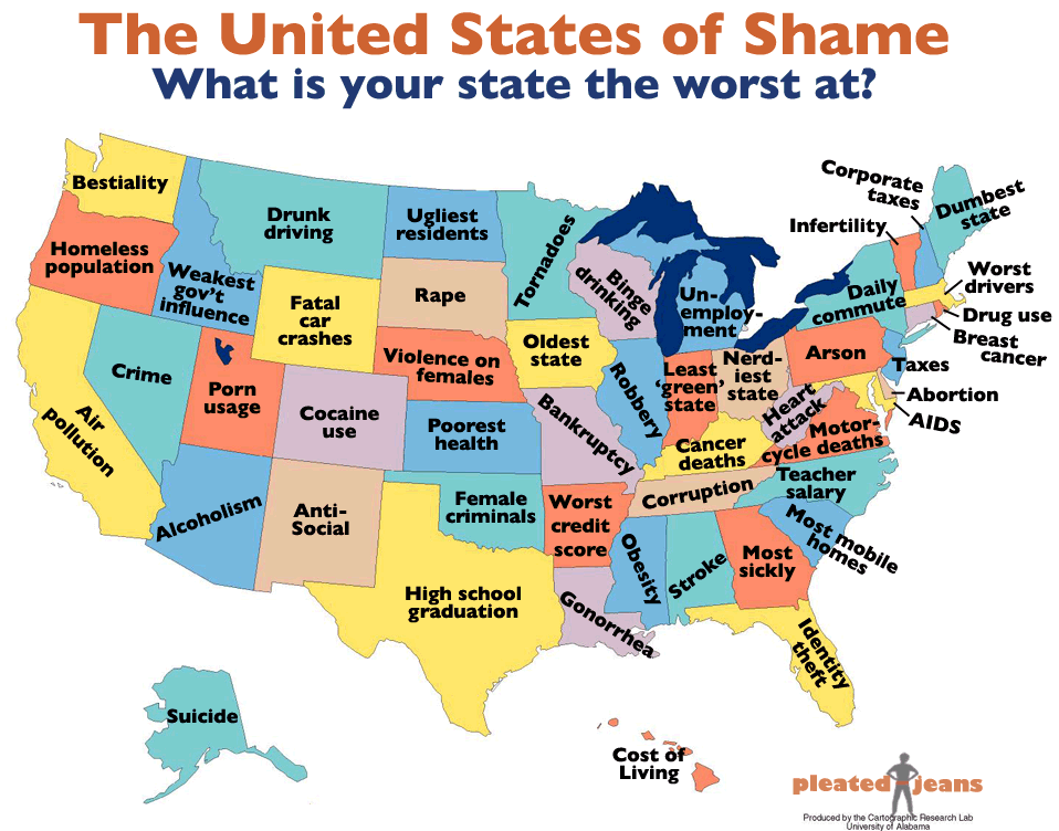
This type of phrasing is what gets people into trouble, especially non-English speakers. To show you what I mean, take the example of Michigan. Apparently, Michigan is "the worst at" unemployment. So... does this mean that the ability of Michigan to successfully accomplish unemployment is low (i.e., that unemployment is low; that employment is high)? No. The same thing for almost everything, save for aspects that are not inherently negative.

This points to the implicit understanding of a negative statement (or question) and the correct (culturally dependent) response to that statement (or question). We understand that Michigan has very high levels of unemployment (one of the worst in the country), which, strictly speaking, makes Michigan the worst at employment (although Nevada presently has the highest unemployment levels). Similarly, we understand that Arkansans have (on average) the worst credit scores in the country, which, strictly speaking, makes Arkansas the worst at credit management.

Conversely, when looking at concepts that are not inherently perceived as negative (e.g., teacher salary or high school graduation), the cognitive dissonance is much lower. The literal and implied meanings behind the label showing Texas being the worst at high school graduation seem pretty coherent, as does the label showing North Carolina being the worst at teacher salaries (although, to be pedantic, it would be more accurate to say that they are the worst at the monetary compensation of teachers).

Then there is "tornadoes"... How can a state be "the worst at" tornadoes? The phrasing of "is the worst at" implies something influenced by society. Tornadoes aren't (AFAIK) a social phenomenon. However, tornado damage is. But how does the viewer know what characteristic of tornadoes is being cited as "the worst"?

In the end, the map is humorous and informative... if (respectively) the viewer understands something about the states and understands the logic behind (what is effectively) a double-negative.

Map originally from here.

UPDATE: A counter-map was made over at Political Language.

At least this map doesn't suffer the problems of language as the one above. However, I have one general question: How can Arizona do "sunniest" well? I mean, I suppose they could have the most social groups (government and private) that enhance the culture of sunniness. However, I think that the label is based on data on the number of sunny days, and not the number of sun societies.

The topography of American swearing

I came across a link to a map from Cartastrphe on the topography of swearing in the United States' 48 contiguous states (one can download a ~12MB pdf of this map at the Cartastrophe site). As one can imagine, metropolitan areas tend to have higher swearing levels than other places, but there are some interesting points.


1. As Huffman points out in his entry, Utah is a depression-point in the swearing topography,
2. I noticed that Flint, MI seems to be the epicenter of Michigander swearing (side note: "Michigander" is in the Firefox spell-checker, while "Obama" still isn't),
3. The lower reaches of the Mississippi River is like a tall (if somewhat short) range of swearing mountains, and is much more contiguous than the swearing mountains that connect the major cities of the South (from Atlanta to DC).

H/T Flowing Data

Saturday, January 22, 2011

Cycled the equivalent of going to Shreveport

Well, since July (when I started recording miles cycled) I've definitely cycled further than the 1050 miles that show up when doing a direction search for bike riding from Ann Arbor. If I made a conservative estimate, it would be closer to 1500 miles (about the biking distance to San Antonio, TX).

Well, after all those miles cycled -- almost all of them commuting to work -- I got clipped yesterday while making the morning commute. It ended up with 4 stitches in my elbow (caused by a contusion), scrapes along my thigh (destroying my trouser leg), and a contusion on my shin (nothing more than what one might get in playing soccer). My bike turned out to be fine, so at least I didn't have to pay out more for bike parts.

Tuesday, January 18, 2011

Let the short-term melting commence!

It's shortly after 2am, and the temperature has crossed over the freezing point, inching into melty territory. So... look forward to icy roads, y'all!

Monday, January 10, 2011

The Americas seem to be lagging behind the world when it comes to mobile web access

Over at the FedEx website, there is an interactive atlas of the world, showing different social characteristics of the world's countries, changing their size (but keeping their rough shape) to represent different variables.

Turns out that the Americas are quite far behind the rest of the world when it comes to mobile web access. (I don't know how this was measured, but the graphic really makes for an interesting way of looking at the world.)


H/T: Flowing Data

Thursday, January 06, 2011

Monday, January 03, 2011

Few people @ GP

Not too many people at the peak tonight... I suppose that the people aren't all back in town yet... Perhaps next week there will be better turn out.

Saturday, January 01, 2011

Changing views of the forest

Happy New Year! Over the months, I have taken photos of the lake from the front of the cabin. Putting them in chronological order, one can see the progression of the seasons...