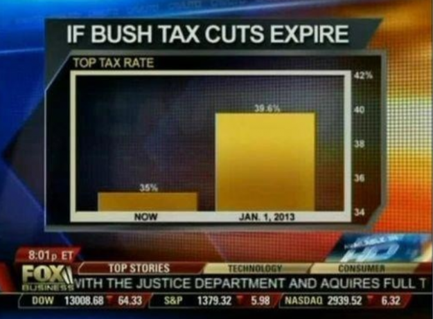
As Nathan Yau correctly points out:
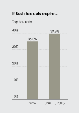
The value axis starts at 34 percent instead of zero, which you don't do with bar charts, because length is the visual cue. That is to say, when you look at this chart, you compare how high each bar is. Fox News might as well have started the vertical axis at 34.9 percent. That would've been more dramatic.And that's true; with a bar chart in which the y-axis goes to zero, you see what a tax expiration would actually look like, in the context of the change in question:
Of course, I would argue that Nathan Yau's point is too specific. Having a bar chart go to zero may make a significant difference appear miniscule or hide the context of the difference. For example, when doing a comparison of the difference in average maximum temperatures (in Fahrenheit) in July 2011 vs. July 2012, the point of 0°F is not a useful starting point:


In both cases, the magnitude of difference between 2011 and 2012 are actually the same amount of heat. However, both cases are problematic for two reasons:
- For accuracy of presentation: neither Fahrenheit nor Centigrade are absolute scales; neither value of zero (0) is actually representative of absolute zero.
- For conceptual interpretation: starting at neither 0°F nor 0°C actually depict an observable enough difference in value to be discernible in the context of summer temperatures.

Oh, look: no change; or (to paraphrase Yau), "With a difference of [6.1 K], the change doesn't look so crazy." But to people living through the summer of 2012, the 6.1K increase did appear significantly hotter than what they remembered from the previous year. In terms of a summer comparison, it looked a lot more like the difference of:

Here, with the cut-off at 70°F, the difference between 2011 and 2012 is far more easy for people to interpret as a large increase between 2011 and 2012. However, it is also deceptive because it isn't accurate. We could make the argument that it shows the context of the difference; that the magnitude of difference between an average high temperature of 98°F in 2012 was far hotter than the average high temperature of 87°F in 2011. However, that's a weak argument to make, since it is contextual and potentially subject to the context of how each person may feel or perceive the temperature difference. In other words, it's the same base logic as to what FOXNews tried to do with their graph: to arbitrarily magnify the context of the change, instead of showing the overall context.
What we need is something to compare the 2012 July temperatures in which you have an absolute zero scale (so as to have good accuracy) but still show the difference in terms that make the difference visually significant.
Well, looking back in the record in Weatherunderground for July average high temperatures at the KARB weather station, we can take the average of all the records going back to 1999 (which is the first year that has July average high temperatures), and then compare 2011 and 2012 by subtracting the 1999-2010 average (12 year temperature average = 79.25°F) from their value (thus showing a difference based on an absolute zero score):

Now we have something that matches the double requirement of accuracy (having the graph go to zero; and having that zero be an absolute zero value) and having visual impact of a significant difference (showing that the 2012 temperature was more than twice the deviation from average than 2011).
Going back the the original, misleading FOXNews graph, it becomes clear that their chart neither shows the information accurately nor does it show it in context. If FOXNews wants to make a credible graph that shows the comparative difference between the current and expected 2013 tax rates, they need to do it based on an absolute-zero scale, and that scale needs to be representative of the longer perspective. Looking at the Historical Top Tax Rates, we can make comparisons of the expected 2013 rates against any relevant period we want. For example, if we make the comparison against all the data available (i.e., 1913-2010), then we get:

Wow! The graph shows that we are currently at a significantly low tax rate compared to the 1913-2010 average (59%), and raising the top rate from 36% to 39.6% would actually keep the rate far below the long-term top tax rate.
But maybe you think that 1913-2010 is way too long of a period. After all, it encompassed World War I, the Dust Bowl, the Great Depression, World War II, the Korean War, and the Vietnam War. In other words, it includes many things that aren't directly relevant to today's tax-payers. Well, then let's take as relevant the rates since 1980 (i.e., since the election of Ronald Reagan, and a period in time that is significant for the vast majority of people who will be paying taxes in 2013, since people born in 1980 will now be working/looking for work). Well, this is what the graph would look like:

True, the change is far more dramatic, but the message still remains the same: the January 1, 2013 tax rate for the top income earners will be lower than the average tax rate for top income earners since 1980 (40.18%). In other words, top income earners will still be paying a rate that is below the average rate of the Reagan-Reagan-Bush-Clinton-Clinton-Bush-Bush-Obama period.
No wonder FOXNews didn't run with these graphs...
UPDATE (2012-08-08): According to NOAA's National Climatic Data Center, July 2012 was the hottest July in US history (via PhysOrg):
The average temperature last month was 77.6 degrees (25 Celsius). That breaks the old record from July 1936, according to the National Oceanic and Atmospheric Administration. Records go back to 1895.
No comments:
Post a Comment