History happened today at 11PM... The second the polls closed on the West coast, the news organizations called the election for Obama. WooT!
While watching the McCain concession speech, I was disgusted by the amount of boo-ing that was going on. It was embarrassing. It was unhonorable. It was - imho - exactly to be expected from the type of crowd McCain's campaign seems to have attracted over the past month.
Tuesday, November 04, 2008


Does a single vote count?
Over at Pure Pedantry, Jake posits the following:
I've always felt that the mathematical argument is the wrong one to take. The election is not a lottery, where there is a single winner (or a set of winners). In that case, there is a definite chance of being "the one" who is chosen. An election, in contrast, is not at all like a lottery. The "deciding" vote could be any and all of the votes that push the election toward the winning candidate. No one person is a "winner" in an election. Rather, the winning party is the "winner". Since it was a group effort, then all the ballots cast toward the winner are "winning votes."
Of course, we like to say, "so-and-so cast the winning vote", like this is something in a movie. However, unless a person has knowledge that his/her vote would be the vote to decide the election, then that vote is as consequential as any other one cast. After all, if the first person who voted didn't cast a vote for candidate A, then the total number of votes cast for candidate A would be one less, regardless of what the last person does. If the last voter KNOWS what his or her vote will do, then that person is - imho - a "winner", but - then again - that vote would be rigged.
So maybe, then, the winning candidate is the one who casts the winning vote, since that person would be the only one who directly benefits from the outcome of the vote, while also (presumably) having voted for him/her-self. Therefore, in all possible iterations of voters-casting-a-winning-ballot, the only constant would be the candidate (except in the case of a 100% win). I've not done the calculations on this, but (to go back to my original point), I've always thought this was a bit of a nonsensical question (at least from the mathematical POV).
Finally, this whole thing seems to me analogous to making a mathematical argument about the non-existence of North Korea. I mean, mathematically speaking, its estimated population is only 0.36% of the total world population (23 million/6.5 billion), but you cannot say they don't exist. In fact, the North Koreans - even though they have such an insignificant impact on world population that they statistically won't exist in a random sample - have been a significant player in East Asian politics. The impact of something, therefore, cannot be based solely on numbers.
I always get in arguments with mathematically-inclined people about whether to vote or not. The mathematically-inclined point out very reasonably that the chances of your vote being decisive are perishingly slim.
(These mathematics are explained clearly in this PBS video by economist Gordon Tullock explaining why he does not vote. Hat-tip: Marginal Revolution)
I've always felt that the mathematical argument is the wrong one to take. The election is not a lottery, where there is a single winner (or a set of winners). In that case, there is a definite chance of being "the one" who is chosen. An election, in contrast, is not at all like a lottery. The "deciding" vote could be any and all of the votes that push the election toward the winning candidate. No one person is a "winner" in an election. Rather, the winning party is the "winner". Since it was a group effort, then all the ballots cast toward the winner are "winning votes."
Of course, we like to say, "so-and-so cast the winning vote", like this is something in a movie. However, unless a person has knowledge that his/her vote would be the vote to decide the election, then that vote is as consequential as any other one cast. After all, if the first person who voted didn't cast a vote for candidate A, then the total number of votes cast for candidate A would be one less, regardless of what the last person does. If the last voter KNOWS what his or her vote will do, then that person is - imho - a "winner", but - then again - that vote would be rigged.
So maybe, then, the winning candidate is the one who casts the winning vote, since that person would be the only one who directly benefits from the outcome of the vote, while also (presumably) having voted for him/her-self. Therefore, in all possible iterations of voters-casting-a-winning-ballot, the only constant would be the candidate (except in the case of a 100% win). I've not done the calculations on this, but (to go back to my original point), I've always thought this was a bit of a nonsensical question (at least from the mathematical POV).
Finally, this whole thing seems to me analogous to making a mathematical argument about the non-existence of North Korea. I mean, mathematically speaking, its estimated population is only 0.36% of the total world population (23 million/6.5 billion), but you cannot say they don't exist. In fact, the North Koreans - even though they have such an insignificant impact on world population that they statistically won't exist in a random sample - have been a significant player in East Asian politics. The impact of something, therefore, cannot be based solely on numbers.
VOTE! ... or shut up.
For everyone (who happens to be reading my blog who can vote in the US): Go out and VOTE today, or shut the fuck up!
For everyone else: Hope that enough clear-headed people go out and VOTE today.
Interesting Get-out-the-vote images
 Cycling in to campus today I saw some interesting get-out-the-vote images. Some tagging images of Obama, others tagging McCain. There were two messages about Obama that student groups used on a series of Obama pictures: anti-abortion and communist imagry. In the first, you can see a pro-life (aka "anti-abortion") sticker placed over Obama's eyes, blinding him. This is an interesting image, since you could argue that it is trying to say that Obama is blind to the immorality of abortion or you could argue that the position that abortion is immoral is a blind one. Not absolutely clear, but that's the problem with imagry-warfare.
The second one has sticker of a Soviet Union flag above Obama's head, almost like he's looking up towards it (although if the person who stuck it there was as OCD as I can be, it would have been more obviously in Obama-image's line-of-sight). It is trying to link Obama with the idea of socialism (something the McCain-Palin ticket has been trying over the past several weeks, ever since their plant - Joe the pseudoplumber - asked Obama a question about the taxes a company he couldn't have purchased would have to pay under an Obama presidency). Unfortunately, the people don't seem to grasp a couple of points. First, communism and socialism are not equivalent (and university students who have taken a class in politics should know the difference). Communism is a form of governance where the mode of production is governed by the people, and governance is done at the commune (or local) level. Socialism is a form of governance where government decisions are made with the idea of benefitting a broad swath of society. The mode of production does not need to be governed by the people (but it is owned by them), nor do governance questions need to be taken at the local level. It is, at best, a middle point between out-and-out capitalism (which we never had) and communism, and it is practiced in many different ways throughout the world. (One could argue that the United States has a form of socialism: corporate socialism.)

Third, one of the constants in many successful communist movements throughout history is the attacks or dimunition of the intelligensia by communists. In Phol Pot's Cambodia, Western educated people were killed. In Mao's China, higher education was frowned upon (yay for the Great Leap Forward?). In Lenin's (and later Stalin's) Soviet Union, engineers and scientists were respected only to the extent that they could help maximize output from production. Much of this sentiment seems (to me) to have arisen because the intelligensia were of the middle and upper classes - the bourgeoisie and (at one point-in-time) nobility - while the communists were trying to get the support of the working-class - otherwise known as the proletariat. Now, look at the Republican strategy in this campaign: a belittling of the intelligensia (Palin's mocking of community organisers sticks out as one early example), a major effort to get the support of the working-class (appeal to the proletariat) via people like Joe the [pseudo]plumber (and earlier with images of "Joe Sixpack" and "hockey moms"), and the painting of regions of the United States (which "just happen" to include large areas including the majority of universities) as liberal or non-American. These tactics seem to be a call for a rousing populism very similar to those used by Lenin, Mao and Phol Pot. ... and Republicans call Obama a socialist. (Not only that - they contradict themselves by calling him and his followers elitists, conflating "elitism" with "socialism"! Ironic much!)
Finally, why choose the flag of the Soviet Union? Why not choose China, Vietnam, Yugoslavia, Poland, East Germany, Romania, Czechoslovakia, Hungary, Bulgaria, Albania, Mongolia, North Korea, or Cuba? Is it because the person happened to have a USSR flag at the time, having placed all the other current and former communist country flags on other posters throughout the university? Is it because the "red scare" is tied most strongly with the USSR? Is it because people recognize the symbol of the USSR? It is funny to me because the person chose to use a sticker of a country that no longer exists, and one that (arguably) never came close to meeting the standard of Marxist communism (devolving into a form of dictatorial pseudocommunism). Following this logic, one might argue that it was chosen because that great neo-conservative Republican president, Ronald Reagan, was the one to destroy Soviet communism, thus saving the world (regardless of evidence showing that it was likely to collapse anyway, and Reagan might have actually prolonged its life or could have transformed it into a thermonuclear-hot war through his constant provocations if it weren't for Gorbachev), and is therefore the appropriate symbol (somehow) for this occaision. (I would have used the Eretreian flag, since it would harken to both communism and Africa, but that would be elitist of me, right?)
These attacks of trying to paint Obama as an elitist socialist are laughable when you break it down, but that's just an uppity elitist hapa talking, not some everyday-American. (Of course, I personally feel that everyday-Americans should try and take higher education seriously, but that must be my elitism shinging through.)

 On the other hand, I saw quite uninspired Obama sticker attacks on McCain. These only involved placing Obama stickers over McCain-Palin ones. Not really thought-provoking. Very effective, though.
Yo voté
...a siete de la mañana.
I was the first person in line at 5:45AM (I was the first person there - before even any poll workers), the second person to fill out their application-to-vote card, and the third person to hand in a ballot. I was all done at 7:13AM. Of course, this meant that I had to wake up at 5AM (and I forgot to turn my phone's enunciator to "on", so was lucky to be woken up by the buzzing of the vibrate-mode). No one was there when I got to Bach - no other voters and no volunteers. I (somewhat arbitrarily) decided to wait at the main entrance (since it is a "main" entrance) for the poll workers, and when they arrived - closer to 6AM - they all decided that, yes, the main entrance would be the one through which people would enter to cast their votes. By that time two other voters had joined the line, and we all sat in the pre-dawn coolness and near-foggy conditions to wait for 7AM.
After some time of sitting on cold concrete, I got up to look back at the line which had been inexorably lengthening up Jefferson St. toward 5th St. It had become long enough that from my position, I could not see the end of the line as it was past where my line-of-sight was cut off by the building. "Oh, wow," I thought, "even in liberal Ann Arbor, where voting Republican is apparently a wasted vote, people are energized to get in early to vote... Or they just want to make sure they get to work on time." Happily, the polls opened at 7AM on-the-nose, and I sprinted (well... walked quickly would have been closer to the mark) to the application table.
Like the last time I voted at Bach School, it seemed to turn into a bit of a cluster-fark in terms of logistics. Let me explain. The polling place is actually in the school's auditorium (which may also act as a cafeteria). There are double-doors at the end of a short corridor and anteroom to let people in to the auditorium. This anteroom area works on polling days to create nothing other than a milling area - a purgatory for those voting - for people waiting, waiting, waiting to vote. However... there is a problem: the application-to-vote table is place immediately inside the auditorium, thus forcing people to go to that table, sign a card, leave the table, go back into the waiting area (or further back into the narrow corridor) to find the back of the line to pick up a ballot. Then people can re-enter the auditorium with their application card and try and get into lines for last-names starting with A-K or L-Z. This is not clearly marked when people get in. Oh... and there is no door designated as an official exit from all of that craziness.
Knowing that all this cluster-farking logistical nightmare was likely to be par for the course this year (plus with all the news stories about voting lines), I decided last week to get up really early today to go and vote. (I even looked up the past-tense form of the Spanish votar so I would know how to write it out.) In the 12 minutes it took for me to sign my application card, wait for the poll volunteer to figure out how to issue me a ballot, fill out the form in a poorly-lit area of the auditorium (they really need lighting along the walls, too), and hand it in, the Purgatory-like waiting area had become clogged with people, the hallway leading outside was filled up, and the line extended around the corner (about 20 minutes later, when I returned to collect my thermos that I forgot outside Jefferson Market, the line had extended to the main entrance of Bach - perhaps it will get so long as to make it around the next corner, as well).
I was the first person in line at 5:45AM (I was the first person there - before even any poll workers), the second person to fill out their application-to-vote card, and the third person to hand in a ballot. I was all done at 7:13AM. Of course, this meant that I had to wake up at 5AM (and I forgot to turn my phone's enunciator to "on", so was lucky to be woken up by the buzzing of the vibrate-mode). No one was there when I got to Bach - no other voters and no volunteers. I (somewhat arbitrarily) decided to wait at the main entrance (since it is a "main" entrance) for the poll workers, and when they arrived - closer to 6AM - they all decided that, yes, the main entrance would be the one through which people would enter to cast their votes. By that time two other voters had joined the line, and we all sat in the pre-dawn coolness and near-foggy conditions to wait for 7AM.
After some time of sitting on cold concrete, I got up to look back at the line which had been inexorably lengthening up Jefferson St. toward 5th St. It had become long enough that from my position, I could not see the end of the line as it was past where my line-of-sight was cut off by the building. "Oh, wow," I thought, "even in liberal Ann Arbor, where voting Republican is apparently a wasted vote, people are energized to get in early to vote... Or they just want to make sure they get to work on time." Happily, the polls opened at 7AM on-the-nose, and I sprinted (well... walked quickly would have been closer to the mark) to the application table.
Like the last time I voted at Bach School, it seemed to turn into a bit of a cluster-fark in terms of logistics. Let me explain. The polling place is actually in the school's auditorium (which may also act as a cafeteria). There are double-doors at the end of a short corridor and anteroom to let people in to the auditorium. This anteroom area works on polling days to create nothing other than a milling area - a purgatory for those voting - for people waiting, waiting, waiting to vote. However... there is a problem: the application-to-vote table is place immediately inside the auditorium, thus forcing people to go to that table, sign a card, leave the table, go back into the waiting area (or further back into the narrow corridor) to find the back of the line to pick up a ballot. Then people can re-enter the auditorium with their application card and try and get into lines for last-names starting with A-K or L-Z. This is not clearly marked when people get in. Oh... and there is no door designated as an official exit from all of that craziness.
Knowing that all this cluster-farking logistical nightmare was likely to be par for the course this year (plus with all the news stories about voting lines), I decided last week to get up really early today to go and vote. (I even looked up the past-tense form of the Spanish votar so I would know how to write it out.) In the 12 minutes it took for me to sign my application card, wait for the poll volunteer to figure out how to issue me a ballot, fill out the form in a poorly-lit area of the auditorium (they really need lighting along the walls, too), and hand it in, the Purgatory-like waiting area had become clogged with people, the hallway leading outside was filled up, and the line extended around the corner (about 20 minutes later, when I returned to collect my thermos that I forgot outside Jefferson Market, the line had extended to the main entrance of Bach - perhaps it will get so long as to make it around the next corner, as well).
Friday, October 31, 2008
The importance of photos in sustainability
 Like in many areas, photography is an important addition to telling the big stories of the world, especially if those stories are too far away or too big to capture in people's minds with words alone. Therefore, just like the importance of war photographers in all armed conflicts going back to the creation of a camera that can capture a candid picture, photography presents the reader with a gritty vision of today.
I have been (tangentially) following the Prix Pictet, and they have found a winner for their 2008 prize: Benoit Aquin. The following quote and picture are from the Prix Pictet website:
Making the formal presentation, Kofi Annan said: "It is my hope that the Prix Pictet, the world's first prize dedicated to photography and sustainability, will help to deepen understanding of the changes taking place in our world and raise public awareness about the urgency of taking preventative action. Each artist has addressed the environmental and social challenges we face in their own personal way. The result is a series of powerful images which seeks to confront us with the scale of the threat we face and to inspire governments, businesses, - and all of us as individuals - to step up to the challenge and support change for a sustainable world."
Benoit Aquin was chosen by an international panel of independent judges, chaired by Francis Hodgson (head of the photographs department at Sotheby's, London) who said:
"The jury were impressed by the overall standard in this the Prix Pictet's first year. The photographers have made it a really tight competition. In the end we are pleased to acknowledge the quite excellent series that Benoit Aquin has made on desertification in China, which in the opinion of the jury just pipped a group of other excellent candidates.
"We are proud to have set a standard to which future Prix Pictet nominees can aspire and we are delighted to compliment Benoit Aquin on a quite splendid achievement."
Critical Mass?
I think I might try it out today... My first Critical Mass turn-out. Looking (briefly) around on the interwebs... I don't find much about Ann Arbor's, save for some photos by I'm a raindog too.
Halloween
Hmmmm.... don't know if I'm really in the mood for it. It's way too warm out for it to be Halloween in Michigan.
On a tangential issue, I learned that Halloween is called Dia de las Brujas (Day of the Witches) in Spanish. Based on the Wikipedia, Halloween has only really be celebrated in Mexico since the 1960s:
On a tangential issue, I learned that Halloween is called Dia de las Brujas (Day of the Witches) in Spanish. Based on the Wikipedia, Halloween has only really be celebrated in Mexico since the 1960s:
In Mexico, Halloween has been celebrated since roughly 1960. There, celebrations have been influenced by the American traditions, such as the costuming of children who visit the houses of their neighbourhood in search of candy. Though the "trick-or-treat" motif is used, tricks are not generally played on residents not providing candy. Older crowds of preteens, teenagers and adults will sometimes organize Halloween-themed parties, which might be scheduled on the nearest available weekend. Usually kids stop by at peoples' houses, knock on their door or the ring the bell and say "¡Noche de Brujas , Halloween!" ('Witches' Night—Halloween!').
Halloween in Mexico begins three days of consecutive holidays, as it is followed by All Saints' Day, which also marks the beginning of the two day celebration of the Day of the Dead or the Día de los Muertos. This might account for the initial explanations of the holiday having a traditional Mexican-Catholic slant.
Thursday, October 30, 2008
Microsoft Office, Graphics, and Filesize
NOTE: I don't know if this works in Office2007 or MacOffice2008.
When you move a graph or picture into Word (or PowerPoint) and then make it smaller, remember that the program doesn’t actually shrink the filesize of the graphic – it enforces a reduction on the full filesize. This is good if you have to restore the graphic to its original dimensions (saving you time in having to find the damn thing again in the future). However, this does make your Word (or PowerPoint) file much larger than it needs to be.
This is only a problem when you are trying to do things to the file (or with the file) that requires a relatively large amount of memory – such as converting to a pdf or modifying a slide show (which happens to have many pictures).
IN WORD:
To fix this in Word, double-click on the picture or graph. This will bring up the Format Picture window. Through this window, you can ultimately shrink the filesize of the picture you selected (or all pictures in the document) to their new dimensions. However, you first have to convert your graphic into what Word recognizes as a “picture”. To do this, first click on the Layout tab, then choose any form of picture layout other than “In line with text”. This transforms how Word deals with your graphic from pretending that it is “text” to allowing that it is actually a picture. Once you click “OK”, double-click on the picture again to re-open the Format Picture window. If you click on the Size tab, you will note that the size of your picture is not 100% of the original (I’m assuming that you have shrunk the image) – this is your indication that the graphic’s filesize has not been altered. Click on the Picture tab, and then on the “Compress…” button. This will bring up the Compress Pictures window. Here, click on the “Change Resolution” to either “Web/Screen” or “Print” (unless you have a photo, don’t worry about the supposed loss in dpi – there usually isn’t much difference in the end). After selecting, press, OK, returning to the Format Picture window. If you click over to the Size tab, you should see that your graphic is now 100% of the size of the original (since you have compressed the filesize of the original to be what it is now). Finally (if you want to have Word treat the graphic as “text” again) click on the Layout tab, and then select “In line with text”, and click OK.
IN POWERPOINT:
Effectively the same, but you don’t have to change the graphic from a “text” object to a “picture” object – PowerPoint treats all graphics as “picture” objects.
IN CONCLUSION:
In conclusion, by doing this, you will save the amount of space needed for your Word and PowerPoint documents. One recent document I applied this technique to went from being 1,789,952 bytes before graphics compression to 896,000 bytes after graphic compression. (Woot!)
When you move a graph or picture into Word (or PowerPoint) and then make it smaller, remember that the program doesn’t actually shrink the filesize of the graphic – it enforces a reduction on the full filesize. This is good if you have to restore the graphic to its original dimensions (saving you time in having to find the damn thing again in the future). However, this does make your Word (or PowerPoint) file much larger than it needs to be.
This is only a problem when you are trying to do things to the file (or with the file) that requires a relatively large amount of memory – such as converting to a pdf or modifying a slide show (which happens to have many pictures).
IN WORD:
To fix this in Word, double-click on the picture or graph. This will bring up the Format Picture window. Through this window, you can ultimately shrink the filesize of the picture you selected (or all pictures in the document) to their new dimensions. However, you first have to convert your graphic into what Word recognizes as a “picture”. To do this, first click on the Layout tab, then choose any form of picture layout other than “In line with text”. This transforms how Word deals with your graphic from pretending that it is “text” to allowing that it is actually a picture. Once you click “OK”, double-click on the picture again to re-open the Format Picture window. If you click on the Size tab, you will note that the size of your picture is not 100% of the original (I’m assuming that you have shrunk the image) – this is your indication that the graphic’s filesize has not been altered. Click on the Picture tab, and then on the “Compress…” button. This will bring up the Compress Pictures window. Here, click on the “Change Resolution” to either “Web/Screen” or “Print” (unless you have a photo, don’t worry about the supposed loss in dpi – there usually isn’t much difference in the end). After selecting, press, OK, returning to the Format Picture window. If you click over to the Size tab, you should see that your graphic is now 100% of the size of the original (since you have compressed the filesize of the original to be what it is now). Finally (if you want to have Word treat the graphic as “text” again) click on the Layout tab, and then select “In line with text”, and click OK.
IN POWERPOINT:
Effectively the same, but you don’t have to change the graphic from a “text” object to a “picture” object – PowerPoint treats all graphics as “picture” objects.
IN CONCLUSION:
In conclusion, by doing this, you will save the amount of space needed for your Word and PowerPoint documents. One recent document I applied this technique to went from being 1,789,952 bytes before graphics compression to 896,000 bytes after graphic compression. (Woot!)
Wednesday, October 29, 2008
UPS, EPA, and A2
The USEPA office in Ann Arbor has - together with UPS - designed an HHV (hydraulic hybrid vehicle) for use in Brown's delivery vehicles. Cool video at the link.
Hat tip to EcoGeek.
Hat tip to EcoGeek.
Friday, October 24, 2008
Solar-powered automatic lawnmower
I still say that a sheep has many more advantages over lawnmowers (for normal applications of lawnmowers, that is), but this one really makes me want to change my mind...
Of course, you still have the issue of what a "lawn culture" in the United States means, but the ingenious combination of a Roomba with solar-power capability all transformed into a lawnmower is just ... brilliant! Now, even though you add all that fertilizer and pesticide to your lawn, you can at least have it cut in a more environmentally friendly manner.
(hat-tip to EcoGeek)
Of course, you still have the issue of what a "lawn culture" in the United States means, but the ingenious combination of a Roomba with solar-power capability all transformed into a lawnmower is just ... brilliant! Now, even though you add all that fertilizer and pesticide to your lawn, you can at least have it cut in a more environmentally friendly manner.
(hat-tip to EcoGeek)
And in the wierdness category...
Larry Flint - of Hustler 'fame' - is making a porno film about Sarah Palin. Entitled, Who's Nailin' Paylin?, the film stars the busty Lisa Ann as the GOP VP nominee. I'm sure the plot of the film is not a very complex one, nor do I imagine that it paints a flattering political picture of the real Sarah Palin. However, it's not because of the technical merits of the film that I'm writing, but about some quotes from an interview with the (perhaps now infamous) actress about the woman she is portraying.
Video contains no nudity, but does have a busty woman with cleavage showing.
Lisa Ann apparently did her homework in 'boning up' for the part (sorry - couldn't resist) by watching the VP debates "over-and-over" as well as Tina Fey's portrayals of Palin, but "the sex is all secondary and second-nature to [her]."Q. Any more [catch-phrases]? Maverick? And uh...
A. All you Joe Six-packs out there... I love that one. And of course, I'm a hockey-mom ... we also need to add a soon-to-be hockey illegitemate grand-mom. It's a good one to throw in there - one she doesn't say, but she should.Q. What do you think of Sarah yourself?A. Oh, I think she's out of her mind. This smoke smile is nothing to [unclear] cannot be satisfied with that."
Q. You've got any questions for Sarah?A. Sarah, I've been what kind of panties you wear. What your sex life is like, and I'm hoping you embrace your inner MILF. And allow me to represent your bootie on my site, because I think you're hot.
Q. Do you think Sarah'll be watching the film?A. I'm not sure she'll be watching the film, but I'm sure she's gonna to find out about it. I don't think she's gonna be that thrilled.
Video contains no nudity, but does have a busty woman with cleavage showing.
Thursday, October 23, 2008
Wednesday, October 22, 2008
Oh, no. Not again.
Apart from being a nice line from The Hitchhiker's Guide to the Galaxy, this sums up my feelings when I read the following headline:
Beetle Invasion Threatens New England Trees.
Although I don't live in New England, the Upper Midwest is still recovering from the impacts of Dutch Elm disease in the 1970s and Emerald Ashborers from just a couple of years ago. Now I find out about an Asian longhorn beetle that can burrow into birch, poplar, willow, sycamore, maple and elm. Hmm... Looking around Ann Arbor, I have seen birch, poplar, willow, sycamore, maple and elm... Many of the trees planted around the city are maples, although the number of sycamores are also sizeable. I wonder how they these beetles will affect oaks, which are another major constituent tree in so-called Tree Town.
If this beetle gets into town, then Ann Arbor might have to plant softwoods that people are not really craze about. It will change the cool summers into heat-island infernos. It might also allow for a greater infestation of invasive shrubs and trees. It will - in the short term - create many eye-sores around the city as trees die and are left un-cut, and then (possibly) create hazards to property and public safety.
I'm not really happy about this ecologically dark-side-to-globalization. (At least some action is being taken on aquatic invasions...)
Beetle Invasion Threatens New England Trees.
Although I don't live in New England, the Upper Midwest is still recovering from the impacts of Dutch Elm disease in the 1970s and Emerald Ashborers from just a couple of years ago. Now I find out about an Asian longhorn beetle that can burrow into birch, poplar, willow, sycamore, maple and elm. Hmm... Looking around Ann Arbor, I have seen birch, poplar, willow, sycamore, maple and elm... Many of the trees planted around the city are maples, although the number of sycamores are also sizeable. I wonder how they these beetles will affect oaks, which are another major constituent tree in so-called Tree Town.
If this beetle gets into town, then Ann Arbor might have to plant softwoods that people are not really craze about. It will change the cool summers into heat-island infernos. It might also allow for a greater infestation of invasive shrubs and trees. It will - in the short term - create many eye-sores around the city as trees die and are left un-cut, and then (possibly) create hazards to property and public safety.
I'm not really happy about this ecologically dark-side-to-globalization. (At least some action is being taken on aquatic invasions...)
McCain's foreign backers and non-backers
Two pieces from the British press. The first one - from the BBC - is about how McCain is categorically not getting backing of any kind from the Russians:
The second one - from The Times - is about how McCain has (hopefully unwittingly) garnered the (possible) endorsement of Al Qaeda (maybe):
The Russian mission to the UN in New York says it has turned down a request from John McCain to help fund his presidential campaign.
Ambassador to the UN Vitaly Churkin and others received standard mail-outs asking them to help "stop the Democrats from seizing control of Washington".
...
Funding denial
The letter to Mr Churkin has a return form which carries the words: "I am proud to stand with our Republican candidates as the Obama Democrats and their wealthy liberal backers focus their attacks squarely on defeating Republicans and gaining control of our government.
"I want to do all I can to help stop the Democrats from seizing control of Washington and implementing their radically liberal policy for our nation."
The form then has a space for a signature over the typed name, Vitaly Churkin.
...
But he also stressed: "Russian authorities are in no way engaged in funding political campaigns or political activities abroad."Apparently the Russians have a sense of humor - sometimes.
The second one - from The Times - is about how McCain has (hopefully unwittingly) garnered the (possible) endorsement of Al Qaeda (maybe):
It emerged today, however, that al-Qaeda supporters have been posting internet messages in recent days hoping for a victory by Mr McCain, even saying they would welcome a pre-election terror attack on the US because it could tip the election the Republican’s way.
...
One message, posted on the extremist website al-Hesbah — which is closely linked to al-Qaeda — said that if the terror group wants to exhaust the US economically and military, then victory for the “impetuous” Republican candidate would benefit them because Mr McCain would continue “the failing march of his predecessor” President Bush.
So... McCain loses the endorsement of former Michigan governor Milliken, but possibly gains the endorsement of Al Qaeda, while also garnering no support from Colin Powell or Russia. Meanwhile, according to an extensive worldwide poll, many (many) people would prefer Obama to be the next president of the US. (No, this doesn't mean that they are telling us how to vote. It only means that many people around the world are keyed into the US elections - maybe because the US is so important in other countries' activities or because the US campaign is so fecking long - and have developed an opinion about it. It is no different than me stating my opinion on British or French elections - which I sometimes have followed.)
The message was posted by Muhammad Haafid, a longtime contributor to the website. He has no direct affiliation to al-Qaeda, making it unclear whether he reflects the views of Osama bin Laden — who has not been heard of for six months — or anyone else in the terror organisation. While Mr McCain fiercely opposes a timetabled withdrawal from Iraq, he has pledged to end the war within four years.
Something new from David Sedaris
I don't normally read The New Yorker, but I was sent an article by David Sedaris, and I normally do read him. It was a piece on undecided voters, and I couldn't help but print it out immediately and devour it like a hot grilled cheese sandwich. The piece, although shorter than my hero-worshiping self would have liked, was funny in only the way that Sedaris can make a topic comical: biting satire (that is closer to high-tea cucumber sandwiches-biting than a 12-inch hoagie-with-extra-onions-biting) with just enough zing to make it really shine.
Below are some of the pieces that I found especially humorous:
Although Sedaris' choice of candidate this November seems to be clear without having to read too closely between the lines, he never comes out and says who it is. (Pardon all the metaphors there.) However, I do love how he wraps up his essay:
Below are some of the pieces that I found especially humorous:
To put [undecided voters] in perspective, I think of being on an airplane. The flight attendant comes down the aisle with her food cart and, eventually, parks it beside my seat. “Can I interest you in the chicken?” she asks. “Or would you prefer the platter of shit with bits of broken glass in it?”I really like how his images - although not stating any particular choice of candidate in this election - make it seem like anyone would be stupid to be an undecided voter in this year's election. It's almost like that South Park episode where the children had to choose between a douche and a turd. This correlation between the choices of presidential candidates and chicken vs. a "platter of shit with bits of broken glass in it" really does sum it up for many voters (on both sides). One choice is seen as the healthy meat option. The other one is a pile of shit with broken glass. It's inconceivable to people who have made their minds up how anyone could even think of having a different opinion. And yet there are those people...
To be undecided in this election is to pause for a moment and then ask how the chicken is cooked.
I mean, really, what’s to be confused about?
Although Sedaris' choice of candidate this November seems to be clear without having to read too closely between the lines, he never comes out and says who it is. (Pardon all the metaphors there.) However, I do love how he wraps up his essay:
I wonder if, in the end, the undecideds aren’t the biggest pessimists of all. Here they could order the airline chicken, but, then again, hmm. “Isn’t that adding an extra step?” they ask themselves. “If it’s all going to be chewed up and swallowed, why not cut to the chase, and go with the platter of shit?”Brilliant.
Ah, though, that’s where the broken glass comes in.
Tuesday, October 21, 2008
Population and CO2
I read an interesting piece over at Prometheus about how European countries have - per capita - not generally performed better than the United States in the period of 1997-2005. There are a few troubling things about this post for me (and it's not because I'm European, a Euro-phile, or a US-hater). The central graph seemed wrong to me. I think it was because the CO2 per capita graph is analogous to the one I wrote about a while ago: it seemed to be comparing things that could not be equally compared across set items.
If per capita CO2 emissions was something that could be standardized across countries, then its base values (CO2 emissions and population) should share some characteristics. Minimally, they should have similar slope values in a direct comparison with each other. If they don't then the value of "per capita CO2" is not a standard unit. Looking at the graph at Prometheus, I chose to compare Denmark (the best actor), Spain (the worst actor) and Luxembourg (one that ends up with near-zero change) against the United States.
For data on CO2, I used data found here. For data on population, I used this data. The values appear to be slightly different from that used on Prometheus, but do not vary so much as to make comparison invalid for these purposes.

As you can see in this first graph, the untransformed values of CO2 emission and population do not provide linear regressions of similar value across all four groups.
Even after a log-log transformation, the values for slope are not very similar, regardless of looking at the trend from 1950-2005 (the available data) or 1990-2005 (since the Kyoto Protocol requires a 10% decrease below 1990 levels).


From this comparison, it seems to me that there is little statistical justification to compare trends of per capita CO2 emissions across countries, even after you do a log-log transformation. So... that would mean there seems to be a problem with the overall argument at Prometheus, since it seems (to me) to presuppose that addressing the issue by looking at per capita CO2 emissions would be a good enough control for population growth.
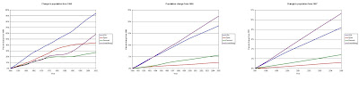
One interesting thing (to me at least) is looking at what is happening at different time-frames. I will use here Prometheus' own methods of comparing change in per capita CO2 emissions against a base level. (I know that I cast doubt on it, but bear with me...) I will compare these per capita graphs against both the population growth and CO2 emissions of the same period. However, instead of only showing 1997-2005, I will also show 1990-2005 and 1950-2005.


If per capita CO2 emissions was something that could be standardized across countries, then its base values (CO2 emissions and population) should share some characteristics. Minimally, they should have similar slope values in a direct comparison with each other. If they don't then the value of "per capita CO2" is not a standard unit. Looking at the graph at Prometheus, I chose to compare Denmark (the best actor), Spain (the worst actor) and Luxembourg (one that ends up with near-zero change) against the United States.
For data on CO2, I used data found here. For data on population, I used this data. The values appear to be slightly different from that used on Prometheus, but do not vary so much as to make comparison invalid for these purposes.

As you can see in this first graph, the untransformed values of CO2 emission and population do not provide linear regressions of similar value across all four groups.
Even after a log-log transformation, the values for slope are not very similar, regardless of looking at the trend from 1950-2005 (the available data) or 1990-2005 (since the Kyoto Protocol requires a 10% decrease below 1990 levels).


From this comparison, it seems to me that there is little statistical justification to compare trends of per capita CO2 emissions across countries, even after you do a log-log transformation. So... that would mean there seems to be a problem with the overall argument at Prometheus, since it seems (to me) to presuppose that addressing the issue by looking at per capita CO2 emissions would be a good enough control for population growth.
One interesting thing (to me at least) is looking at what is happening at different time-frames. I will use here Prometheus' own methods of comparing change in per capita CO2 emissions against a base level. (I know that I cast doubt on it, but bear with me...) I will compare these per capita graphs against both the population growth and CO2 emissions of the same period. However, instead of only showing 1997-2005, I will also show 1990-2005 and 1950-2005.


What is apparent is that population growth is having an effect on the values of CO2 emissions in Luxembourg, especially when one considers changes since 1990 or 1997 (since Luxembourg has the highest population growth rate during this period of time, and has the smallest population to begin with). Due to this issue of scale, Luxembourg (and likely other small-population countries) should be dropped from the initial analysis. (Luxembourg was also a country that had little similarity between other countries from above).
Photos
Autumn is a great time to take photos. The warm light is further heightened by the red and orange leaves as well as brick. Walking around campus these days of the Fall Break provide great photos of the buildings that we otherwise shuffle past day-by-day. I also found that a new art installation was being, well, installed in front of the art museum extesion.


 New art installation.
 Due to the construction of the UM art museum annex, these class-gift benches were moved into their own little plaza. However, one bench didn't make the move, and is sitting on its own closer to Haven Hall. (so sad...)

 A mostly vacant Ingalls Mall. (Fall Break makes grad students feel like little lords of the campus, and - given how much we make - that's not such a bad thing.) The trees along the mall have not yet started to turn, and is indicative of how much impact they have on the view from the steps of the library. As you can see from the photo on the left, both Kraus (biology) and the Burton Tower (clock tower) are completely obscured from the trees. In the right-hand photo, Rackham (graduate school) is mostly obscured from view. Happily (for me), neither the Modern Languages Building nor the Alumni Center are visible from either vantage point, since I personally think that both of these buildings are rather more like blemishes upon the Central Campus (admittedly from differen decades); not truly "fitting" amongst the other buildings.

New landscaping construction along the formerly named E. University Ave.

The Samuel Trask Dana Building in the autumn sunlight.

 New art installation.
I don't know if I like it or not... The shot on the left looks almost like a kobold sorcerer (D&D reference if you didn't know...)

 Due to the construction of the UM art museum annex, these class-gift benches were moved into their own little plaza. However, one bench didn't make the move, and is sitting on its own closer to Haven Hall. (so sad...)
A view east from the ramp going up to the Harlan Hatcher Graduate Library entrance on the Diag. I really like that two-topped pine. It looks like something out of a Dr. Seuss book, and I wonder if it was purposefully done.


 A mostly vacant Ingalls Mall. (Fall Break makes grad students feel like little lords of the campus, and - given how much we make - that's not such a bad thing.) The trees along the mall have not yet started to turn, and is indicative of how much impact they have on the view from the steps of the library. As you can see from the photo on the left, both Kraus (biology) and the Burton Tower (clock tower) are completely obscured from the trees. In the right-hand photo, Rackham (graduate school) is mostly obscured from view. Happily (for me), neither the Modern Languages Building nor the Alumni Center are visible from either vantage point, since I personally think that both of these buildings are rather more like blemishes upon the Central Campus (admittedly from differen decades); not truly "fitting" amongst the other buildings.
Makes me wonder if I should get a "real" job...
Sometimes, you just have to wonder whether being an academic is a "smart" thing to be...
Via PhDComics:

Via PhDComics:
Monday, October 20, 2008
Subscribe to:
Posts (Atom)